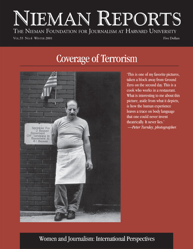
Coverage of Terrorism
Through the night of September 11, 2001, photographer Peter Turnley took refuge in a second-floor office in a clothing store, its windows blown out by the force of the attack on the World Trade Center. As he tried to absorb what he was seeing, he documented the devastation. At dawn, he moved close to the site and fastened his journalistic eye on faces whose expressions evoke our feelings of loss. From covering war, Turnley knew that “the most important pictures…are after the battle, when one sees the human impact.”
As the horrific events of September 11 unfolded, the scope of the tragedy I witnessed began to sink in. The terrorist attacks in New York, Washington, D.C., and Pennsylvania became the biggest breaking news event of my lifetime, charged with more emotion and disbelief than could ever have been imagined. As art director of The Charlotte Observer, it became my job to figure out how the newspaper could cover the story graphically.
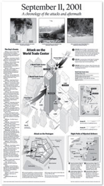
Few graphics are as valuable to readers as step-by-step diagrams that we use to show, in detail, what happened and when. Immediately that day, working with our national desk, we began to create a graphic time-line of events, with diagrams and explanations of the attacks on the World Trade Center and Pentagon and the Pennsylvania plane crash. To obtain and convey accurate information, we studied video feeds from network television again and again. We also used photographs and other reference materials to draw three-dimensional views of what would become Ground Zero and of the Pentagon. We added locator maps of Manhattan and the crash site in Pennsylvania. The result of our work—a full-page graphic portrayal of these tragedies—appeared in a special section of the next day’s Observer.
As news continued to break that week, we created a map and chronology of the trail of suspected hijackers and converted our World Trade Center diagram into a smaller scaled graphic and added color to illustrate the still emerging details of the attack and aftermath. And we devised graphic strategies to illustrate other aspects of the emerging story.
When we learned Osama bin Laden and his terrorist group, Al Qaeda, were prime suspects in the September 11 attacks, we wanted to give readers a better understanding of who bin Laden is, where he operates from, and who supports him. We drew a full-page color map of the volatile region around Afghanistan and Pakistan, with an enlarged detail map showing the topography, cities, roads, military installations, and suspected Al Qaeda training camps. Symbols on the map also illustrated the Al Qaeda connections to other countries in the region. The map was published in a Sunday Perspective section that focused on Afghanistan history and politics. The reader response was tremendous—so great, in fact, that we reproduced it on heavier stock paper that was then wrapped around newspaper ad inserts. By doing this, readers and teachers could have a more durable copy of this map.
Once again, television reports and Web sources played key roles in providing information that appeared in our graphics. Progressively, news of these events and their aftermath became more complex and graphically challenging. While we continued to respond to breaking news, we also started to devise new ways of providing broader context and understanding.
We did this by producing several “primers” on terrorism, Afghanistan, the Taliban, Al Qaeda, and Islam. Because of the wealth of resources and reporting now available online, our job of finding accurate information to build these primer graphics was made simpler than a decade ago when we constructed graphics as the 1991 Persian Gulf War was escalating. We also drew from the experience of our staff artists who produced graphics during the Gulf War. It then became a race against the clock. Would we be able to get this series of primers into the newspaper before military strikes began?
At the same time, in anticipation of a military response, we wanted to prepare—for possible future use—scenarios of how the military strikes might proceed and how the forces might be utilized, along with other pertinent information to supplement wire service graphics. We dug through our archives and once again cannibalized our Gulf War graphics, pulling out pieces that might be relevant to military action in Afghanistan. We also researched and drew many graphics that might be useful, such as maps of the region and aircraft carrier battle groups, then readied these elements, again for possible use. To do this, we relied on our award-winning graphics staff, many of whom have had a lot of experience in military affairs. Our news graphics editor, William Pitzer, served as a major command illustrator for the U.S. Air Force during the Vietnam War and worked at another newspaper handling military graphics during the Gulf War, as did David Puckett, our informational graphics specialist.
In researching material to go into these graphic displays, we consulted local university professors who specialize in Middle East studies or other pertinent topics. We also looked to Web sites that we can rely on in terms of accuracy, which we’ve determined by doing in-house fact checking of the information provided. These include www.bbc.co.uk/ (BBC Online homepage), www.fas.org (Federation of American Scientists) and www.af.mil (American Air Force Link Online). The BBC site is especially useful and provides highly detailed maps that we use to produce our daily attack graphics. Non-American governmental Web sites are often more forthcoming with information than U.S. sites, so each day we scan foreign sites. The Federation of American Scientists site and the Air Force Link site provide highly detailed information about military equipment, how it is used, and other key military information.
To ensure the consistency of our war graphics, we created a unique design and title format: The Observer’s Guide to Aircraft Carriers; The Observer’s Guide to Afghan Rebels; The Observer’s Guide to Attack Forces, etc. Using this format, we produce explanatory graphics that are instantly recognizable as being related to the ongoing story of the war against terrorism, even though they appear in various sizes and locations throughout the paper. This visual display of reporting is a key element of our paper’s extensive daily coverage.
Graphics help readers visualize the story in The Charlotte Observer.
On October 7, when U.S. and British missiles struck numerous targets in Afghanistan, we were ready. Immediately, we converted reference maps we’d made into templates for daily attack updates. We utilized our format and began producing The Observer’s Guide to Allied Attacks. On days when these graphics do not make it into the newspaper because of space constraints, they appear on our paper’s Web site (www.charlotte.com). Many other Knight Ridder newspapers have direct links to our newspaper’s online war graphics, and the positive feedback we’ve received convinces us there is a need for this daily map, even if it is only seen online.
As we’d anticipated, the allied forces are using much of the same equipment in Afghanistan that was used in the Gulf War, including fighter jets, B-1, B-2 and B-52 bombers, aircraft carriers, and submarines. Tomahawk missiles were launched at terrorist training camps and targets associated with the Taliban. The attack began rather conventionally, with air-to-ground and sea-to-ground attacks on Taliban positions, and as Secretary of Defense Donald Rumsfeld said, the success of military actions will be heavily dependent upon surprise. With concern about security and secrecy, we do not expect to receive much in the way of detailed military information from the Pentagon briefings.
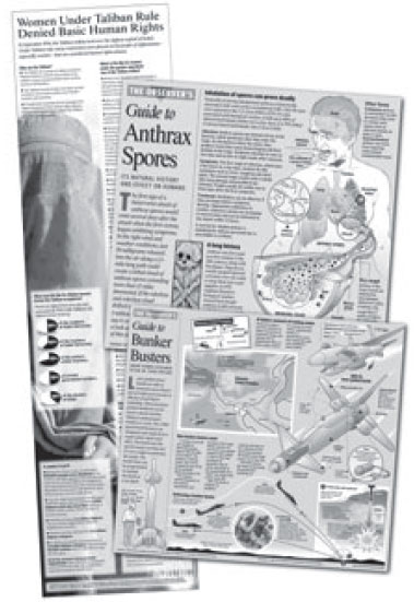
One of the ways we have devised to cover this new war is to provide information in a format that readers can’t get anywhere else. Along with more “primer” graphics to help readers take in information about different aspects of this war at home and abroad, we are continuing with “The Observer’s Guide to” format. We are creating different informative graphics, including a “bunker busters” graphic. These detail how the terrorists’ caves—where they are presumably in hiding—might be destroyed with special deep penetrating missiles. And we are also helping readers to examine the plight of Afghan women under Taliban rule, along with other newsworthy subjects, through similar use of graphic displays.
Our daily coverage is definitely enhanced by sharing our graphic displays with our Web audience. Observer staff artist Jacob Piercy converts newspaper graphics into animated “flash” and other still graphics that we post online as they are created. He has received numerous e-mails and phone calls praising his online graphics and requesting more. They are archived at: www.charlotte.com/observergraphics/archive.html. In creating graphics for the Web, we work hard to make sure that we don’t add gratuitous animation or sound, which can trivialize the issues of life and death involved. We don’t want these displays to have the look or feel of video games or cartoons. We know that online graphics add other dimensions to stories we report, so the newspaper allocates the necessary resources to do them even in these budget-tightening times.
The Observer created a unique design and title format for its “Guide to” graphics.
Changing technology constantly influences the crafting of newspaper graphics, whether it’s new computer software, the Internet, or other technological advances. By taking advantage of technologies that presently exist, we can quickly create accurate, detailed and visually compelling graphics that provide relevant, contextual information to help readers understand the issues that interest and affect them. Increasing understanding is always an important part of what newspapers do. At a time like this, when Americans are waging war in a distant land and much is happening to evoke fear at home, we have a greater obligation to provide accurate information and make it as easy as possible for our readers to absorb it.
Joanne Miller is art director at The Charlotte Observer where she supervises a staff of five artists. Before going to the Observer, she was deputy visuals editor/graphics for the St. Paul Pioneer Press and worked at the Los Angeles Times, The Washington Post, Army Times, and Honolulu Star-Bulletin.
Few graphics are as valuable to readers as step-by-step diagrams that we use to show, in detail, what happened and when. Immediately that day, working with our national desk, we began to create a graphic time-line of events, with diagrams and explanations of the attacks on the World Trade Center and Pentagon and the Pennsylvania plane crash. To obtain and convey accurate information, we studied video feeds from network television again and again. We also used photographs and other reference materials to draw three-dimensional views of what would become Ground Zero and of the Pentagon. We added locator maps of Manhattan and the crash site in Pennsylvania. The result of our work—a full-page graphic portrayal of these tragedies—appeared in a special section of the next day’s Observer.
As news continued to break that week, we created a map and chronology of the trail of suspected hijackers and converted our World Trade Center diagram into a smaller scaled graphic and added color to illustrate the still emerging details of the attack and aftermath. And we devised graphic strategies to illustrate other aspects of the emerging story.
When we learned Osama bin Laden and his terrorist group, Al Qaeda, were prime suspects in the September 11 attacks, we wanted to give readers a better understanding of who bin Laden is, where he operates from, and who supports him. We drew a full-page color map of the volatile region around Afghanistan and Pakistan, with an enlarged detail map showing the topography, cities, roads, military installations, and suspected Al Qaeda training camps. Symbols on the map also illustrated the Al Qaeda connections to other countries in the region. The map was published in a Sunday Perspective section that focused on Afghanistan history and politics. The reader response was tremendous—so great, in fact, that we reproduced it on heavier stock paper that was then wrapped around newspaper ad inserts. By doing this, readers and teachers could have a more durable copy of this map.
Once again, television reports and Web sources played key roles in providing information that appeared in our graphics. Progressively, news of these events and their aftermath became more complex and graphically challenging. While we continued to respond to breaking news, we also started to devise new ways of providing broader context and understanding.
We did this by producing several “primers” on terrorism, Afghanistan, the Taliban, Al Qaeda, and Islam. Because of the wealth of resources and reporting now available online, our job of finding accurate information to build these primer graphics was made simpler than a decade ago when we constructed graphics as the 1991 Persian Gulf War was escalating. We also drew from the experience of our staff artists who produced graphics during the Gulf War. It then became a race against the clock. Would we be able to get this series of primers into the newspaper before military strikes began?
At the same time, in anticipation of a military response, we wanted to prepare—for possible future use—scenarios of how the military strikes might proceed and how the forces might be utilized, along with other pertinent information to supplement wire service graphics. We dug through our archives and once again cannibalized our Gulf War graphics, pulling out pieces that might be relevant to military action in Afghanistan. We also researched and drew many graphics that might be useful, such as maps of the region and aircraft carrier battle groups, then readied these elements, again for possible use. To do this, we relied on our award-winning graphics staff, many of whom have had a lot of experience in military affairs. Our news graphics editor, William Pitzer, served as a major command illustrator for the U.S. Air Force during the Vietnam War and worked at another newspaper handling military graphics during the Gulf War, as did David Puckett, our informational graphics specialist.
In researching material to go into these graphic displays, we consulted local university professors who specialize in Middle East studies or other pertinent topics. We also looked to Web sites that we can rely on in terms of accuracy, which we’ve determined by doing in-house fact checking of the information provided. These include www.bbc.co.uk/ (BBC Online homepage), www.fas.org (Federation of American Scientists) and www.af.mil (American Air Force Link Online). The BBC site is especially useful and provides highly detailed maps that we use to produce our daily attack graphics. Non-American governmental Web sites are often more forthcoming with information than U.S. sites, so each day we scan foreign sites. The Federation of American Scientists site and the Air Force Link site provide highly detailed information about military equipment, how it is used, and other key military information.
To ensure the consistency of our war graphics, we created a unique design and title format: The Observer’s Guide to Aircraft Carriers; The Observer’s Guide to Afghan Rebels; The Observer’s Guide to Attack Forces, etc. Using this format, we produce explanatory graphics that are instantly recognizable as being related to the ongoing story of the war against terrorism, even though they appear in various sizes and locations throughout the paper. This visual display of reporting is a key element of our paper’s extensive daily coverage.
Graphics help readers visualize the story in The Charlotte Observer.
On October 7, when U.S. and British missiles struck numerous targets in Afghanistan, we were ready. Immediately, we converted reference maps we’d made into templates for daily attack updates. We utilized our format and began producing The Observer’s Guide to Allied Attacks. On days when these graphics do not make it into the newspaper because of space constraints, they appear on our paper’s Web site (www.charlotte.com). Many other Knight Ridder newspapers have direct links to our newspaper’s online war graphics, and the positive feedback we’ve received convinces us there is a need for this daily map, even if it is only seen online.
As we’d anticipated, the allied forces are using much of the same equipment in Afghanistan that was used in the Gulf War, including fighter jets, B-1, B-2 and B-52 bombers, aircraft carriers, and submarines. Tomahawk missiles were launched at terrorist training camps and targets associated with the Taliban. The attack began rather conventionally, with air-to-ground and sea-to-ground attacks on Taliban positions, and as Secretary of Defense Donald Rumsfeld said, the success of military actions will be heavily dependent upon surprise. With concern about security and secrecy, we do not expect to receive much in the way of detailed military information from the Pentagon briefings.
One of the ways we have devised to cover this new war is to provide information in a format that readers can’t get anywhere else. Along with more “primer” graphics to help readers take in information about different aspects of this war at home and abroad, we are continuing with “The Observer’s Guide to” format. We are creating different informative graphics, including a “bunker busters” graphic. These detail how the terrorists’ caves—where they are presumably in hiding—might be destroyed with special deep penetrating missiles. And we are also helping readers to examine the plight of Afghan women under Taliban rule, along with other newsworthy subjects, through similar use of graphic displays.
Our daily coverage is definitely enhanced by sharing our graphic displays with our Web audience. Observer staff artist Jacob Piercy converts newspaper graphics into animated “flash” and other still graphics that we post online as they are created. He has received numerous e-mails and phone calls praising his online graphics and requesting more. They are archived at: www.charlotte.com/observergraphics/archive.html. In creating graphics for the Web, we work hard to make sure that we don’t add gratuitous animation or sound, which can trivialize the issues of life and death involved. We don’t want these displays to have the look or feel of video games or cartoons. We know that online graphics add other dimensions to stories we report, so the newspaper allocates the necessary resources to do them even in these budget-tightening times.
The Observer created a unique design and title format for its “Guide to” graphics.
Changing technology constantly influences the crafting of newspaper graphics, whether it’s new computer software, the Internet, or other technological advances. By taking advantage of technologies that presently exist, we can quickly create accurate, detailed and visually compelling graphics that provide relevant, contextual information to help readers understand the issues that interest and affect them. Increasing understanding is always an important part of what newspapers do. At a time like this, when Americans are waging war in a distant land and much is happening to evoke fear at home, we have a greater obligation to provide accurate information and make it as easy as possible for our readers to absorb it.
Joanne Miller is art director at The Charlotte Observer where she supervises a staff of five artists. Before going to the Observer, she was deputy visuals editor/graphics for the St. Paul Pioneer Press and worked at the Los Angeles Times, The Washington Post, Army Times, and Honolulu Star-Bulletin.