Parents stand up to speak at school board meetings, clutching a copy of the newspaper. The dog-eared newsprint is the source of research that buttresses their comments.
School officials pore over the newspaper, looking for academic trends in other districts or studying how their district’s test scores stack up against districts of similar demographics.
People relocating use the information we analyze and publish about school districts as a guide to where to buy their home.
In an editorial, a suburban weekly newspaper points to the metro daily newspaper as the authoritative source of information on school spending.
The Philadelphia Inquirer has found its first two annual Report Cards on the Schools to be not only good journalism, but journalism with a broad impact on its readers. “Accountability” is the buzzword in public education today, and school report cards help readers hold their schools accountable. This is newspaper journalism that doesn’t end up on the curb waiting for recycling day. It’s daily journalism with a shelf life.
Like many newspapers, The Inquirer has found that teaming education reporters with computer-assisted reporting analysts results in a powerful tool to assess the successes and failures of local schools. The Inquirer’s first Report Card, called “A District In Distress,” looked only at the Philadelphia city school district in 1994. Three years later, a 20-page Report Card was published. Last September, the Report Card had grown to a 30-page broadsheet section.
A report card on schools is but one example of the type of data analysis now being conducted by newsroom specialists that formerly was reserved for the academic researcher or social scientist. While a researcher’s study might take months or years to complete and publish, a newspaper can turn around an analysis of test scores, for example, in a few days. The statistical tools and methods used by the newspaper often are the same as those of the researcher.
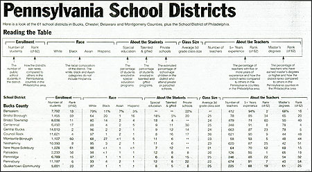
The 1997 Report Card covered 164 public school districts in southeastern Pennsylvania and South Jersey, plus the giant Philadelphia school system (which has 22 sub-districts called “clusters”). In 1998, nearly 100 non-public high schools in the Philadelphia region were invited to be a part of the 1998 report. The response was remarkable, covering virtually all major Catholic, Quaker and private schools.
The section served up timely, comprehensive data in such areas as spending, teacher experience and salaries, class size, test results and SAT scores. A small part of the data came from state databases. However, by the time the state’s data is made public it is already outdated. To include the most up-to-date statistics possible, The Inquirer conducts its own survey of school superintendents.
Simply presenting the data doesn’t mean a report is complete. The newspaper must try to guide readers in interpreting the numbers. At the same time, though, journalists must ask themselves just how far can a newspaper go in rating how well schools are doing their jobs.
Some of the best measures of school districts in The Inquirer’s Report Card turn out not to be numbers at all. Much of the report is filled with traditional, in-depth reporting on the schools by the newspaper’s education staff. We also devote space to what we call “Points of Pride”—a non-numbers feature that allows school superintendents to tout features of their district that make them particularly proud. It might be a championship marching band, an effective after-school tutoring program, or an abundance of National Merit Scholar finalists. Their points are edited only for clarity and are included in each district’s profile.
Our Report Cards also aren’t large enough to print all of the relevant data about each district and school. Therefore, databases that include test scores, financial information and other numerical information from state sources as well as our own superintendents’ survey are available through The Inquirer’s on-line Web site.
These databases are heavily used by Internet surfers. The New Jersey EDITOR'S NOTE:
Read the 1998 Report Card »
Read the New Jersey data »Department of Education links to our presentation of its data from its Web site. We frequently hear from parents, researchers, realtors and librarians who have come to rely on our on-line education databases.
In the printed Report Cards, the most striking differences among schools can be found in test scores. However, a basic problem with such scores is that they are on a school level only. We have no individual student data. Test scores also have been found to bear a strong relationship to the student’s income. However, at the school level in Pennsylvania, we have only the percentage of students eligible for free or reduced-price lunch as the proxy for income. New Jersey education officials have attempted a better demographic indicator, which rates school districts by family income, educational attainment of residents and other factors that are related to test results. Yet New Jersey’s “district factor group” measurement is on the district, not the school, level.
Even if we were able to get individual student data from the schools, there are educators who maintain the standardized tests are seriously flawed as indicators of student performance. Is one elementary school not doing its job as well as another elementary school across town if its third-grade test scores are lower? How large a difference between test scores is significant? How do you adjust for variations in the number of students taking the tests each year? These questions shouldn’t halt an analysis of test scores, but they should make the newspaper—or any analyst—realize a test’s measurement capabilities aren’t absolute.
We use the test scores both in the report and for guidance in our stories. A first step each year is to run a regression analysis looking at the relationship of test scores to income. “Overachievers”—schools performing far better than they should have, given their income level—and “underachievers”—schools performing far worse than expected—are flagged for on-site reporting. Reporters contact these schools to learn more about what is happening there each day. Overachieving schools, for example, might employ innovative teaching methods that could be shared by other schools.
The Inquirer also uses the test scores to rate schools in two ways:
The first ranking (using quartiles, which breaks data into four equally sized parts, each representing 25 percent of the schools) is broad and of limited use. It should come as no surprise that the wealthiest school districts populate the top 25 percent of schools, and the poorest populate the bottom 25 percent. We have, however, found the second ranking elicited some surprises. The schools in Pennsylvania, for example, are broken down in our analysis into five equally sized groups (quintiles) based on the percentage of students eligible for free or reduced-price lunch. Then, within each quintile, schools are broken into quartiles based on their test scores. A relatively wealthy school might fall into the top 25 percent of all schools in the state but fall to the bottom half or bottom 25 percent of all schools when rated against other schools of similar income. This kind of analysis is something that parents and educators had no access to prior to our publication of this data. In fact, school district officials call us to ask for extra copies of our test score studies.
Readers have seized upon the report as essential to their understanding of how the schools are performing. And The Inquirer views the Report Card research as the foundation for the reporting we do on education issues and controversies about teaching methods or school performance that might arise. An added benefit is that the Report Card strengthens communications with readers. We include the E-mail addresses of the education team in the annual section as well as a special Email address for the Report Card. We received well over 100 E-mail notes and numerous telephone calls from readers. Last fall, orders for a special reprint of the section arrived in our office before we’d even published it in The Inquirer. That reprint then went into a second printing and, so far, 7,000 additional copies have been sold.

Neill A. Borowski is Director of Computer-Assisted Reporting/Analysis at The Philadelphia Inquirer. Connie Langland is the lead education reporter for the annual Report Card on the Schools.
School officials pore over the newspaper, looking for academic trends in other districts or studying how their district’s test scores stack up against districts of similar demographics.
People relocating use the information we analyze and publish about school districts as a guide to where to buy their home.
In an editorial, a suburban weekly newspaper points to the metro daily newspaper as the authoritative source of information on school spending.
The Philadelphia Inquirer has found its first two annual Report Cards on the Schools to be not only good journalism, but journalism with a broad impact on its readers. “Accountability” is the buzzword in public education today, and school report cards help readers hold their schools accountable. This is newspaper journalism that doesn’t end up on the curb waiting for recycling day. It’s daily journalism with a shelf life.
Like many newspapers, The Inquirer has found that teaming education reporters with computer-assisted reporting analysts results in a powerful tool to assess the successes and failures of local schools. The Inquirer’s first Report Card, called “A District In Distress,” looked only at the Philadelphia city school district in 1994. Three years later, a 20-page Report Card was published. Last September, the Report Card had grown to a 30-page broadsheet section.
A report card on schools is but one example of the type of data analysis now being conducted by newsroom specialists that formerly was reserved for the academic researcher or social scientist. While a researcher’s study might take months or years to complete and publish, a newspaper can turn around an analysis of test scores, for example, in a few days. The statistical tools and methods used by the newspaper often are the same as those of the researcher.
The 1997 Report Card covered 164 public school districts in southeastern Pennsylvania and South Jersey, plus the giant Philadelphia school system (which has 22 sub-districts called “clusters”). In 1998, nearly 100 non-public high schools in the Philadelphia region were invited to be a part of the 1998 report. The response was remarkable, covering virtually all major Catholic, Quaker and private schools.
The section served up timely, comprehensive data in such areas as spending, teacher experience and salaries, class size, test results and SAT scores. A small part of the data came from state databases. However, by the time the state’s data is made public it is already outdated. To include the most up-to-date statistics possible, The Inquirer conducts its own survey of school superintendents.
Simply presenting the data doesn’t mean a report is complete. The newspaper must try to guide readers in interpreting the numbers. At the same time, though, journalists must ask themselves just how far can a newspaper go in rating how well schools are doing their jobs.
Some of the best measures of school districts in The Inquirer’s Report Card turn out not to be numbers at all. Much of the report is filled with traditional, in-depth reporting on the schools by the newspaper’s education staff. We also devote space to what we call “Points of Pride”—a non-numbers feature that allows school superintendents to tout features of their district that make them particularly proud. It might be a championship marching band, an effective after-school tutoring program, or an abundance of National Merit Scholar finalists. Their points are edited only for clarity and are included in each district’s profile.
Our Report Cards also aren’t large enough to print all of the relevant data about each district and school. Therefore, databases that include test scores, financial information and other numerical information from state sources as well as our own superintendents’ survey are available through The Inquirer’s on-line Web site.
These databases are heavily used by Internet surfers. The New Jersey EDITOR'S NOTE:
Read the 1998 Report Card »
Read the New Jersey data »Department of Education links to our presentation of its data from its Web site. We frequently hear from parents, researchers, realtors and librarians who have come to rely on our on-line education databases.
In the printed Report Cards, the most striking differences among schools can be found in test scores. However, a basic problem with such scores is that they are on a school level only. We have no individual student data. Test scores also have been found to bear a strong relationship to the student’s income. However, at the school level in Pennsylvania, we have only the percentage of students eligible for free or reduced-price lunch as the proxy for income. New Jersey education officials have attempted a better demographic indicator, which rates school districts by family income, educational attainment of residents and other factors that are related to test results. Yet New Jersey’s “district factor group” measurement is on the district, not the school, level.
Even if we were able to get individual student data from the schools, there are educators who maintain the standardized tests are seriously flawed as indicators of student performance. Is one elementary school not doing its job as well as another elementary school across town if its third-grade test scores are lower? How large a difference between test scores is significant? How do you adjust for variations in the number of students taking the tests each year? These questions shouldn’t halt an analysis of test scores, but they should make the newspaper—or any analyst—realize a test’s measurement capabilities aren’t absolute.
We use the test scores both in the report and for guidance in our stories. A first step each year is to run a regression analysis looking at the relationship of test scores to income. “Overachievers”—schools performing far better than they should have, given their income level—and “underachievers”—schools performing far worse than expected—are flagged for on-site reporting. Reporters contact these schools to learn more about what is happening there each day. Overachieving schools, for example, might employ innovative teaching methods that could be shared by other schools.
The Inquirer also uses the test scores to rate schools in two ways:
- How the school ranked compared with all other schools of the same grade in the state, and
- How the school ranked compared with schools of similar demographics in the state.
The first ranking (using quartiles, which breaks data into four equally sized parts, each representing 25 percent of the schools) is broad and of limited use. It should come as no surprise that the wealthiest school districts populate the top 25 percent of schools, and the poorest populate the bottom 25 percent. We have, however, found the second ranking elicited some surprises. The schools in Pennsylvania, for example, are broken down in our analysis into five equally sized groups (quintiles) based on the percentage of students eligible for free or reduced-price lunch. Then, within each quintile, schools are broken into quartiles based on their test scores. A relatively wealthy school might fall into the top 25 percent of all schools in the state but fall to the bottom half or bottom 25 percent of all schools when rated against other schools of similar income. This kind of analysis is something that parents and educators had no access to prior to our publication of this data. In fact, school district officials call us to ask for extra copies of our test score studies.
Readers have seized upon the report as essential to their understanding of how the schools are performing. And The Inquirer views the Report Card research as the foundation for the reporting we do on education issues and controversies about teaching methods or school performance that might arise. An added benefit is that the Report Card strengthens communications with readers. We include the E-mail addresses of the education team in the annual section as well as a special Email address for the Report Card. We received well over 100 E-mail notes and numerous telephone calls from readers. Last fall, orders for a special reprint of the section arrived in our office before we’d even published it in The Inquirer. That reprint then went into a second printing and, so far, 7,000 additional copies have been sold.

Neill A. Borowski is Director of Computer-Assisted Reporting/Analysis at The Philadelphia Inquirer. Connie Langland is the lead education reporter for the annual Report Card on the Schools.


