The Los Angeles Times has had a prominent online presence for a decade with its Web site. But it wasn’t until this spring that a genuine effort was made to tap into its full potential and integrate the print and online staffs. There has been experimentation with reporters’ online notebooks and a shift in how the site’s content is generated and arranged.
Perhaps the most significant turning point in this new venture came this summer, when editors who’d spent their careers on the print side were asked to venture into the digital world of journalism and think about how to attract more readers. The path we charted is part of an ongoing attempt at the Times to give latimes.com its own voice, while also bridging two mediums (print and online) in ways that encourage the newspaper’s staff to think more comfortably—and instinctively—about working for both.
“I think that all papers, including ours, were too slow to really embrace the Web,” said Dean Baquet who, as managing editor, succeeded John S. Carroll as editor of the newspaper on August 15th. “And I would include myself in that, as a reporter and as an editor. It felt to us for years—for too long—it felt like this odd thing that required us to do more work, and now I think of it as an essential part of the paper, and when I say ‘the paper,’ I also think of the Web site. It’s very different. It should be different. It should look different.”
Creating a Different Look
Even after an earlier, much-publicized redesign, latimes.com looked like the paper did. The Times’s front-page stories, mostly foreign and national news, became lead stories on latimes.com’s homepage. Web visitors could find little on the site that was not lifted directly from the paper’s pages.
One day this summer three of us—the deputy business editor, Joel Sappell, tapped by Baquet to act as a “guest editor” with the online staff; Dan Gaines, a senior online producer, and I—stood at a computer screen in the online newsroom looking at the site’s homepage. We could count as many as 14 headlines, and that was only on the top half of the screen. Few of these stories were drawing much Web traffic, perhaps because the site provided no way for readers to tell which were the more important.
Sappell envisioned a more streamlined look—one strong enterprise or feature story, packaged with lead art, and a few headlines running alongside it. He wanted snappier headlines and a story mix that was distinct from the paper. He looked over at the box in the screen’s upper right-hand corner with local TV video clips, a feature we knew was drawing fewer than a hundred visits daily.
“What if we were to move this box down to another place on the page?,” Sappell asked Gaines. A moment later, he asked about the possibility of placing a homepage photo gallery where the video clips were located. Then, pointing to a spot on the screen just below where Sappell’s envisioned gallery might go, I wondered aloud, “What if we put the breaking-news stories here in a box?”
So began a week filled with experiments and risks. Promotional boxes were moved—or made bigger—to display eye-catching photos and give the site a more vibrant feel. Stories about food and the outdoors rose to the top of the page, and television and movies received even better play than before.
Sappell and I attended the same news meetings as print editors. But working with the online staff, we dug deeper into story lists to find content that might resonate with Web users. One day we featured a story about Asian women who go to excruciating steps to avoid the sun and stay white. The provocative nature of the article—accompanied by a rather unsettling shot of a woman sitting behind a steering wheel wearing a Darth Vader-like helmet and other photos—proved exceptionally popular. It drew more than 36,000 page views that day, making it the most requested story.
As we watched which stories users were gravitating to, it became apparent that celebrity, conspiracy and sex are quite popular topics on the Web. Photos, too, attract viewers. “I’m hearing from the masthead editors downstairs that they like it—fewer stories, better display, that it’s working very well,” Sappell declared at an online staff meeting.
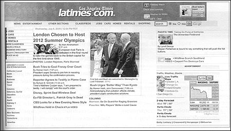
The Los Angeles Times online homepage prior to suggested changes by "guest editors."
Making Changes
At the Times, change hasn’t come easily, nor has it come without resistance. Those who work on the extended news desk, which handles breaking news for the online site, didn’t like having their headlines set aside (and placed in the new smaller box) to make room for larger, splashier features. Other assignment editors weren’t thrilled with the interruption in workflow when the guest-editor-of-the-week called or e-mailed them for early postings. Copyeditors were rattled. How could they guarantee the same quality with copy if they were being pushed to move stories in a matter of minutes?
Once some of this initial anxiety wore off—and people began negotiating the rules—a palpable sense of energy settled in. Print editors, for example, began to realize that they now had another platform to think about. With that realization came a sense of ownership about a medium that previously had been more or less ignored. “Why can’t we run it with a bigger picture? Can we do video?,” editors started to ask. Meanwhile, the noon meeting at latimes.com evolved into free-flowing conversations about story placement and design, rather than the usual mind-numbing discussions about technical issues.
Rob Barrett, the site’s general manager, was also reiterating his long-standing pitch: experiment, share ideas, and watch what competitors do. “We’re five years behind the planet earth. We’ve got to get with it,” he told the staff.
Soon after Barrett’s arrival in January, he and Baquet were holding meetings with department heads in the newsroom to preach the importance of the Web and talk about changes ahead. “There were some very basic connections that had never been made between the Web staff and key people on the editorial side and the business side of the paper,” Barrett explained. “So we’re trying to do a lot of culture change on both sides.”
Until a few months ago, hardly anyone in the newsroom or senior management even knew where the online operation was located or who was in charge of it. The focus has always been to aim for a Page One story or, better yet, column one, the coveted home for long-form features.
So some of us have found this new embrace of the Web exciting—and long overdue.
Integrating the print and online staffs requires a paradigm shift that Baquet began to pursue earlier this year. As a long-time newspaper editor, he says he knew intellectually that the Internet was important, but its full power—and potential—did not become tangible to him until he saw the impact bloggers were having during the 2004 presidential campaign. Declining circulation figures also entered into heightened interest in online readership. (In the six month period ending March 31, the Times reported its steepest decline in several years, as daily circulation fell 6.5 percent and Sunday’s paid readership plunged 7.9 percent.)
Top editors now regard Web users as part of the Times’s readership, and they view the vast online community of bloggers as a part of the paper’s future outreach. “There’s plenty of handwringing in the business these days about circulation losses,” Carroll said. “If you consider the people who read us on the Web site, there’s no problem. It’s actually very, very good.” There have been about a dozen reporters’ online notebooks (akin to blogs) since the site’s redesign, most tailored around specific events, such as the Cannes Film Festival, the Los Angeles Film Festival, and the Tour de France.
The most extensive online reporting effort involved coverage of the presentations by TV networks in New York in mid-May. For five days, network executives and celebrities put on flashy presentations and attend star-studded parties to promote new prime-time shows. With three reporters and a business editor filing dispatches from the scene, staff writer Shawn Hubler pulled the narrative together from her home in Laguna Beach, while I was working as the editor in Los Angeles.
Internal feedback was overwhelmingly positive. But at one point, around 6:30 in the morning, Hubler and I agreed that we truly understood what it’s like to be bloggers. (They have no life.) As much as editors liked the result (particularly when bloggers like Defamer linked to it), reporters in the field were tired and frustrated. They had filed dispatches morning, afternoon and night, which left them virtually no time to develop sources or story ideas. Some were also uncomfortable with the notebook’s biting style and worried that the blog was blurring the line between opinion and news reporting.
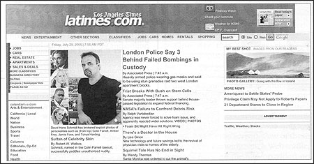
A redesigned homepage of latimes.com, with more emphasis on enterprise features and images.
The Web Site’s Future
Latimes.com, which is fifth among U.S. newspaper sites in the number of visitors it draws, generates revenues that run into the tens of millions of dollars and draws 5.5 million unique viewers a month, up by 39 percent from a year ago. And page views grew by 7 percent, according to data from Sage, The Tribune Co.’s metrix reporting tool. The publishing side wants to increase and diversify the site’s advertising and its audience, since about 70 percent of latimes.com users are from outside the five-county area in Southern California. Our audience isn’t as loyal as advertisers would like: In June, only about 17 percent of new users returned to the site after their initial visit. Nor do our site’s daily visitors—the majority of whom are men between 35-44 in age—resemble the younger digital audience the Times would like to attract.
There are plans to invest newsroom resources (i.e. staff) in the online operation. The goal is to have a Web editor working for each department in the newsroom. Barrett and Baquet are also collaborating on an ambitious plan to develop new content and rebuild the site.
Barrett intends to target entertainment industry insiders (as users and advertisers) by providing Web-specific content and a database of entertainment and travel listings. To this end, consultants and staffers are at work on two new products: a site focused on news and information about awards, such as the Oscars and Emmys, and a Hollywood page in which bloggers weigh in on the day’s news and gossip.
Podcasting of Times’s stories began in August, and there is talk of having the site be a conduit for the work of citizen journalists and bloggers. “No one in my opinion has really solved the problem of what a newspaper site ought to be, because it’s a local and national information business, as well as something that reflects the paper,” said Barrett. “Latimes.com is evolving …. The issue is how fast and how far can we go with something that’s great because there are so many competitors. If we’re not fast enough, they’re going to figure out ideas before we do it.”
If our recent experience is prologue, the Times will be rushing full speed into the digital universe in 2006—wrestling with how to maintain its commitment to high quality, resource-rich hard news reporting while enabling its Web site to attract more readers by spotlighting edgier and glitzier stories. There is also hope that the Web will offer a way for the newspaper to strengthen its relationship with Southern California communities, a goal that has long eluded the paper.
The Web, Baquet says, “should be part of who we are. We’re a serious, hard-hitting newspaper, and we always will be. The Web offers a way to get a glimpse of what people want to read and what people care about.”
Barbara A. Serrano, a 2002 Nieman Fellow, is Web news editor for features at the Los Angeles Times. Previously, she helped supervise coverage of the television industry and was deputy political editor during the 2004 presidential campaign. She is a former political editor and reporter at The Seattle Times.
Perhaps the most significant turning point in this new venture came this summer, when editors who’d spent their careers on the print side were asked to venture into the digital world of journalism and think about how to attract more readers. The path we charted is part of an ongoing attempt at the Times to give latimes.com its own voice, while also bridging two mediums (print and online) in ways that encourage the newspaper’s staff to think more comfortably—and instinctively—about working for both.
“I think that all papers, including ours, were too slow to really embrace the Web,” said Dean Baquet who, as managing editor, succeeded John S. Carroll as editor of the newspaper on August 15th. “And I would include myself in that, as a reporter and as an editor. It felt to us for years—for too long—it felt like this odd thing that required us to do more work, and now I think of it as an essential part of the paper, and when I say ‘the paper,’ I also think of the Web site. It’s very different. It should be different. It should look different.”
Creating a Different Look
Even after an earlier, much-publicized redesign, latimes.com looked like the paper did. The Times’s front-page stories, mostly foreign and national news, became lead stories on latimes.com’s homepage. Web visitors could find little on the site that was not lifted directly from the paper’s pages.
One day this summer three of us—the deputy business editor, Joel Sappell, tapped by Baquet to act as a “guest editor” with the online staff; Dan Gaines, a senior online producer, and I—stood at a computer screen in the online newsroom looking at the site’s homepage. We could count as many as 14 headlines, and that was only on the top half of the screen. Few of these stories were drawing much Web traffic, perhaps because the site provided no way for readers to tell which were the more important.
Sappell envisioned a more streamlined look—one strong enterprise or feature story, packaged with lead art, and a few headlines running alongside it. He wanted snappier headlines and a story mix that was distinct from the paper. He looked over at the box in the screen’s upper right-hand corner with local TV video clips, a feature we knew was drawing fewer than a hundred visits daily.
“What if we were to move this box down to another place on the page?,” Sappell asked Gaines. A moment later, he asked about the possibility of placing a homepage photo gallery where the video clips were located. Then, pointing to a spot on the screen just below where Sappell’s envisioned gallery might go, I wondered aloud, “What if we put the breaking-news stories here in a box?”
So began a week filled with experiments and risks. Promotional boxes were moved—or made bigger—to display eye-catching photos and give the site a more vibrant feel. Stories about food and the outdoors rose to the top of the page, and television and movies received even better play than before.
Sappell and I attended the same news meetings as print editors. But working with the online staff, we dug deeper into story lists to find content that might resonate with Web users. One day we featured a story about Asian women who go to excruciating steps to avoid the sun and stay white. The provocative nature of the article—accompanied by a rather unsettling shot of a woman sitting behind a steering wheel wearing a Darth Vader-like helmet and other photos—proved exceptionally popular. It drew more than 36,000 page views that day, making it the most requested story.
As we watched which stories users were gravitating to, it became apparent that celebrity, conspiracy and sex are quite popular topics on the Web. Photos, too, attract viewers. “I’m hearing from the masthead editors downstairs that they like it—fewer stories, better display, that it’s working very well,” Sappell declared at an online staff meeting.

The Los Angeles Times online homepage prior to suggested changes by "guest editors."
Making Changes
At the Times, change hasn’t come easily, nor has it come without resistance. Those who work on the extended news desk, which handles breaking news for the online site, didn’t like having their headlines set aside (and placed in the new smaller box) to make room for larger, splashier features. Other assignment editors weren’t thrilled with the interruption in workflow when the guest-editor-of-the-week called or e-mailed them for early postings. Copyeditors were rattled. How could they guarantee the same quality with copy if they were being pushed to move stories in a matter of minutes?
Once some of this initial anxiety wore off—and people began negotiating the rules—a palpable sense of energy settled in. Print editors, for example, began to realize that they now had another platform to think about. With that realization came a sense of ownership about a medium that previously had been more or less ignored. “Why can’t we run it with a bigger picture? Can we do video?,” editors started to ask. Meanwhile, the noon meeting at latimes.com evolved into free-flowing conversations about story placement and design, rather than the usual mind-numbing discussions about technical issues.
Rob Barrett, the site’s general manager, was also reiterating his long-standing pitch: experiment, share ideas, and watch what competitors do. “We’re five years behind the planet earth. We’ve got to get with it,” he told the staff.
Soon after Barrett’s arrival in January, he and Baquet were holding meetings with department heads in the newsroom to preach the importance of the Web and talk about changes ahead. “There were some very basic connections that had never been made between the Web staff and key people on the editorial side and the business side of the paper,” Barrett explained. “So we’re trying to do a lot of culture change on both sides.”
Until a few months ago, hardly anyone in the newsroom or senior management even knew where the online operation was located or who was in charge of it. The focus has always been to aim for a Page One story or, better yet, column one, the coveted home for long-form features.
So some of us have found this new embrace of the Web exciting—and long overdue.
Integrating the print and online staffs requires a paradigm shift that Baquet began to pursue earlier this year. As a long-time newspaper editor, he says he knew intellectually that the Internet was important, but its full power—and potential—did not become tangible to him until he saw the impact bloggers were having during the 2004 presidential campaign. Declining circulation figures also entered into heightened interest in online readership. (In the six month period ending March 31, the Times reported its steepest decline in several years, as daily circulation fell 6.5 percent and Sunday’s paid readership plunged 7.9 percent.)
Top editors now regard Web users as part of the Times’s readership, and they view the vast online community of bloggers as a part of the paper’s future outreach. “There’s plenty of handwringing in the business these days about circulation losses,” Carroll said. “If you consider the people who read us on the Web site, there’s no problem. It’s actually very, very good.” There have been about a dozen reporters’ online notebooks (akin to blogs) since the site’s redesign, most tailored around specific events, such as the Cannes Film Festival, the Los Angeles Film Festival, and the Tour de France.
The most extensive online reporting effort involved coverage of the presentations by TV networks in New York in mid-May. For five days, network executives and celebrities put on flashy presentations and attend star-studded parties to promote new prime-time shows. With three reporters and a business editor filing dispatches from the scene, staff writer Shawn Hubler pulled the narrative together from her home in Laguna Beach, while I was working as the editor in Los Angeles.
Internal feedback was overwhelmingly positive. But at one point, around 6:30 in the morning, Hubler and I agreed that we truly understood what it’s like to be bloggers. (They have no life.) As much as editors liked the result (particularly when bloggers like Defamer linked to it), reporters in the field were tired and frustrated. They had filed dispatches morning, afternoon and night, which left them virtually no time to develop sources or story ideas. Some were also uncomfortable with the notebook’s biting style and worried that the blog was blurring the line between opinion and news reporting.

A redesigned homepage of latimes.com, with more emphasis on enterprise features and images.
The Web Site’s Future
Latimes.com, which is fifth among U.S. newspaper sites in the number of visitors it draws, generates revenues that run into the tens of millions of dollars and draws 5.5 million unique viewers a month, up by 39 percent from a year ago. And page views grew by 7 percent, according to data from Sage, The Tribune Co.’s metrix reporting tool. The publishing side wants to increase and diversify the site’s advertising and its audience, since about 70 percent of latimes.com users are from outside the five-county area in Southern California. Our audience isn’t as loyal as advertisers would like: In June, only about 17 percent of new users returned to the site after their initial visit. Nor do our site’s daily visitors—the majority of whom are men between 35-44 in age—resemble the younger digital audience the Times would like to attract.
There are plans to invest newsroom resources (i.e. staff) in the online operation. The goal is to have a Web editor working for each department in the newsroom. Barrett and Baquet are also collaborating on an ambitious plan to develop new content and rebuild the site.
Barrett intends to target entertainment industry insiders (as users and advertisers) by providing Web-specific content and a database of entertainment and travel listings. To this end, consultants and staffers are at work on two new products: a site focused on news and information about awards, such as the Oscars and Emmys, and a Hollywood page in which bloggers weigh in on the day’s news and gossip.
Podcasting of Times’s stories began in August, and there is talk of having the site be a conduit for the work of citizen journalists and bloggers. “No one in my opinion has really solved the problem of what a newspaper site ought to be, because it’s a local and national information business, as well as something that reflects the paper,” said Barrett. “Latimes.com is evolving …. The issue is how fast and how far can we go with something that’s great because there are so many competitors. If we’re not fast enough, they’re going to figure out ideas before we do it.”
If our recent experience is prologue, the Times will be rushing full speed into the digital universe in 2006—wrestling with how to maintain its commitment to high quality, resource-rich hard news reporting while enabling its Web site to attract more readers by spotlighting edgier and glitzier stories. There is also hope that the Web will offer a way for the newspaper to strengthen its relationship with Southern California communities, a goal that has long eluded the paper.
The Web, Baquet says, “should be part of who we are. We’re a serious, hard-hitting newspaper, and we always will be. The Web offers a way to get a glimpse of what people want to read and what people care about.”
Barbara A. Serrano, a 2002 Nieman Fellow, is Web news editor for features at the Los Angeles Times. Previously, she helped supervise coverage of the television industry and was deputy political editor during the 2004 presidential campaign. She is a former political editor and reporter at The Seattle Times.


