During the past several decades, satellite technology has provided an amazing new ability to observe the earth-atmosphere system. With satellites, the most remote regions of the globe can be viewed as readily as the least remote regions, and data can be collected globally within a few days. Some instruments can obtain surface data even in the presence of a substantial cloud cover, while other instruments can provide the data to produce three-dimensional visualizations of the structure of such atmospheric phenomena as hurricanes and thunderstorms.
Satellites collect data relevant to a wide range of environmental topics, from the ozone hole and low-level pollution in the atmosphere, to deforestation and glacier retreats on the land, to algae blooms and El Niño-signaling temperature patterns in the oceans, to biomass burning and shrinking lakes or eroding coastlines. In each of these cases, and many others, the amount of information that the satellites can provide is enormous. By carefully selecting satellite imagery, these pictures can be used quite effectively by reporters to illustrate many points. For example, journalists who might be reporting on the shrinking of the Aral Sea (caused largely by the diversion of inflowing waters for such purposes as irrigation) can vividly portray this shrinkage by presenting side-by-side, identically geolocated images from different decades.
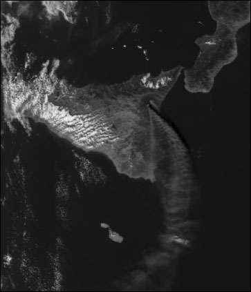
Eruption of Mount Etna, in Sicily, as viewed from NASA’s Aqua satellite on October 30, 2002, using data from the Moderate Resolution Imaging Spectroradiometer (MODIS) instrument. Original image in color, courtesy of the MODIS Science Team.
Types of Satellite Data
Satellite data come in different types, but a common factor is that all satellite instruments measure radiation and only radiation. Some sensors measure various wavelengths of visible radiation, all of which our eyes can see, and other sensors measure ultraviolet, infrared, microwave or other types of radiation, none of which our eyes can see. In any event, no matter what the topic of ultimate application, what’s measured directly is exclusively radiation.
RELATED ARTICLE
"Finding Environmental Satellite Images on the Web"Satellite images constructed from visible data have one inherent gigantic advantage, which is that the images are generally readily understood just by looking at them: Clouds look like clouds, sea ice floes look like sea ice floes, land/sea boundaries are readily identified, etc. Furthermore, the value of some visible imagery has been clear since the first earth-observing satellites were launched decades ago. A prime example of this utility is provided by the visible imagery of hurricanes. Hurricanes form over warm ocean areas, fed by evaporation from the ocean beneath. In view of their oceanic origin, prior to satellites hurricanes were often not observed until just hours before landfall. Now they are readily recognizable in satellite visible images, often days before landfall, thereby enabling what can be lifesaving warnings to the communities along their paths.
Visible radiation is often ideal for observing hurricanes, clouds or, under clear conditions, many phenomena at the earth’s surface. Satellite instruments measuring only visible radiation, however, have the same limitations that our eyes have. They are unable to measure phenomena that our eyes can’t see, and any data they collect on surface phenomena are obscured if there’s a substantial cloud cover intervening between the surface and the instrument.
Fortunately, many phenomena that cannot readily be measured with visible radiation can be determined through the use of other types of radiation. Temperatures, whether atmospheric, land or oceanic, can be calculated (at least approximately) from infrared data. The ozone amounts in the atmosphere can be calculated (again at least approximately) from ultraviolet data. Many surface variables, including snow cover, sea ice cover, and vegetation cover, can be monitored even in the presence of a substantial cloud cover through the use of microwave data. The list goes on and on, with many dozens of variables being able to be calculated through satellite observations, using one type of radiation or another.
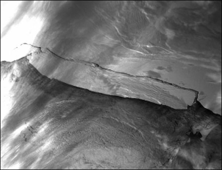
Calving of a major iceberg off the coast of Antarctica, as viewed from NASA’s Terra satellite on March 28, 2000, using data from the MODIS instrument. This iceberg is twice the size of Delaware and broke off from Antarctica’s Ross Ice Shelf, necessitating remapping of the coastal boundaries. Original image in color, courtesy of Jacques Descloitres and the MODIS Science Team.
Using Information Collected By Satellites
Of course, no matter how good they are, for the satellite data to be useful the user must be able to understand them. For much of the data, scientists and computers greatly aid this process by converting the streams of numerical information into maps, often color-coded, of the relevant geophysical quantities. The color codes used by scientists in research publications are often intimidating to the general public because of having too many colors, sometimes seemingly randomly selected. This is not a difficulty for people used to color-coded images, and it often increases the amount of information relayed. However, if the same color scale is used to present the image to readers or viewers who are intimidated by the scale, the amount of information relayed could sink to zero. Therefore, it is often appropriate to simplify the color scale, sometimes to the point of doing away with the numerical color bar altogether and instead presenting just the image and a statement in the caption along the lines of: Warm temperatures (or high ozone amounts, etc.) are indicated in shades of red and cold temperatures in shades of blue.
Fortunately, by now computers are so advanced that, in general, changing color scales is relatively minor. Journalists who want to use a satellite image to illustrate a story but find the available image too complicated should not hesitate to ask the image provider to adjust the color scale (even to a gray scale for a black-and-white publication). Also, since most scientists are not astute regarding color choices, it would not be out of line for a journalist to make suggestions.
As with all sources of information, satellite data can be misused. A very important aspect of environmental issues concerns changes over time, such as increasing atmospheric pollution, decreasing water quality, global warming, or sea level rise. Satellite data can very effectively monitor and help to illustrate environmental changes in many variables. However, like statistics, they can be misused to give a distorted picture of the change that has occurred.
Consider, for instance, a satellite record that reveals a particular variable increasing from 1980 to 1985, then decreasing back to the 1980 level by 1990, increasing back to the 1985 level by 1995, and decreasing back to the 1980 level by 2000. In this case, the full record clearly shows a systematic 10-year cycle; but if someone presents only the 1985 and 2000 results, it can look like a 15-year decrease, whereas if someone else presents only the 1980 and 1995 results, it can look like a 15-year increase. In cases like this, to show a more complete picture, it’s often extremely useful to present satellite-derived time series in addition to the satellite imagery. The time series, if available, can be presented as an insert in the corner of an image.
Similarly to the case of images and the options for color scales, time series can be made more or less informative and understandable depending on the choice of averaging interval. For example: Satellite-derived time series of northern hemisphere and southern hemisphere monthly average sea-ice concentrations from the late 1970’s to the end of the 20th century provide a great deal of information, but the only signal that comes through well in the monthly average plots is the well known and totally unsurprising fact that much more ice exists in winter than in summer. The seasonal cycle so dominates the picture that the long-term change is not visible. By simplifying the plots to show only yearly averages, however, it becomes clear that the northern hemisphere ice cover decreased overall, while the southern hemisphere ice increased, although neither uniformly.
The northern hemisphere case of decreasing sea ice coverage has received considerable attention because of its possible connection with global warming. Without the satellite record, which provides global sea ice coverage every few days, evidence of the changes would be far less comprehensive or convincing. The satellite-derived plots give a much more complete picture of overall changes than any individual image could and show the reader much better than most verbal descriptions both the direction of the changes and the considerable fluctuations.
Understood well and used properly, satellite-derived imagery and plots can add substantially to the information relayed through articles about environmental issues and environmental change.
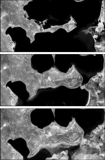
Shrinking of the Aral Sea, in west-central Asia, as viewed in three Landsat images, from May 29, 1973, August 19, 1987, and July 29, 2000, respectively. The increased land area (gray) and reduced sea area (black) is clear as one progresses from the 1973 to 1987 to 2000 image. The shrinkage of the sea, caused by humans siphoning off millions of gallons of water from the inflowing rivers, has destroyed the sea’s fish population, eliminated the former profitable commercial fishing industry, and caused thousands of tons of salty soil from the former lake bed to be blown across the region, damaging crop yields and air quality. Original images in color, courtesy of the United States Geological Survey EROS Data Center, based on data provided by the Landsat Science Team.
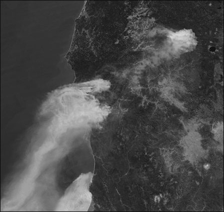
Wildfires burning in Oregon, as viewed from NASA’s Aqua satellite on August 12, 2002, using data from the MODIS instrument. The fire was sparked by lightning and by August 14 had consumed over 375,000 acres in Oregon and northern California. Original image in color, courtesy of Jacques Descloitres, MODIS Land Rapid Response Team.
Claire Parkinson is a climatologist at the NASA Goddard Space Flight Center, using satellite data to examine global climate and climate change, with a focus on polar sea ice. She is also project scientist for the Aqua spacecraft, launched on May 4, 2002, and author of the book “Earth From Above: Using Color-Coded Satellite Images to Examine the Global Environment,” published by University Science Books.
Satellites collect data relevant to a wide range of environmental topics, from the ozone hole and low-level pollution in the atmosphere, to deforestation and glacier retreats on the land, to algae blooms and El Niño-signaling temperature patterns in the oceans, to biomass burning and shrinking lakes or eroding coastlines. In each of these cases, and many others, the amount of information that the satellites can provide is enormous. By carefully selecting satellite imagery, these pictures can be used quite effectively by reporters to illustrate many points. For example, journalists who might be reporting on the shrinking of the Aral Sea (caused largely by the diversion of inflowing waters for such purposes as irrigation) can vividly portray this shrinkage by presenting side-by-side, identically geolocated images from different decades.

Eruption of Mount Etna, in Sicily, as viewed from NASA’s Aqua satellite on October 30, 2002, using data from the Moderate Resolution Imaging Spectroradiometer (MODIS) instrument. Original image in color, courtesy of the MODIS Science Team.
Types of Satellite Data
Satellite data come in different types, but a common factor is that all satellite instruments measure radiation and only radiation. Some sensors measure various wavelengths of visible radiation, all of which our eyes can see, and other sensors measure ultraviolet, infrared, microwave or other types of radiation, none of which our eyes can see. In any event, no matter what the topic of ultimate application, what’s measured directly is exclusively radiation.
RELATED ARTICLE
"Finding Environmental Satellite Images on the Web"Satellite images constructed from visible data have one inherent gigantic advantage, which is that the images are generally readily understood just by looking at them: Clouds look like clouds, sea ice floes look like sea ice floes, land/sea boundaries are readily identified, etc. Furthermore, the value of some visible imagery has been clear since the first earth-observing satellites were launched decades ago. A prime example of this utility is provided by the visible imagery of hurricanes. Hurricanes form over warm ocean areas, fed by evaporation from the ocean beneath. In view of their oceanic origin, prior to satellites hurricanes were often not observed until just hours before landfall. Now they are readily recognizable in satellite visible images, often days before landfall, thereby enabling what can be lifesaving warnings to the communities along their paths.
Visible radiation is often ideal for observing hurricanes, clouds or, under clear conditions, many phenomena at the earth’s surface. Satellite instruments measuring only visible radiation, however, have the same limitations that our eyes have. They are unable to measure phenomena that our eyes can’t see, and any data they collect on surface phenomena are obscured if there’s a substantial cloud cover intervening between the surface and the instrument.
Fortunately, many phenomena that cannot readily be measured with visible radiation can be determined through the use of other types of radiation. Temperatures, whether atmospheric, land or oceanic, can be calculated (at least approximately) from infrared data. The ozone amounts in the atmosphere can be calculated (again at least approximately) from ultraviolet data. Many surface variables, including snow cover, sea ice cover, and vegetation cover, can be monitored even in the presence of a substantial cloud cover through the use of microwave data. The list goes on and on, with many dozens of variables being able to be calculated through satellite observations, using one type of radiation or another.

Calving of a major iceberg off the coast of Antarctica, as viewed from NASA’s Terra satellite on March 28, 2000, using data from the MODIS instrument. This iceberg is twice the size of Delaware and broke off from Antarctica’s Ross Ice Shelf, necessitating remapping of the coastal boundaries. Original image in color, courtesy of Jacques Descloitres and the MODIS Science Team.
Using Information Collected By Satellites
Of course, no matter how good they are, for the satellite data to be useful the user must be able to understand them. For much of the data, scientists and computers greatly aid this process by converting the streams of numerical information into maps, often color-coded, of the relevant geophysical quantities. The color codes used by scientists in research publications are often intimidating to the general public because of having too many colors, sometimes seemingly randomly selected. This is not a difficulty for people used to color-coded images, and it often increases the amount of information relayed. However, if the same color scale is used to present the image to readers or viewers who are intimidated by the scale, the amount of information relayed could sink to zero. Therefore, it is often appropriate to simplify the color scale, sometimes to the point of doing away with the numerical color bar altogether and instead presenting just the image and a statement in the caption along the lines of: Warm temperatures (or high ozone amounts, etc.) are indicated in shades of red and cold temperatures in shades of blue.
Fortunately, by now computers are so advanced that, in general, changing color scales is relatively minor. Journalists who want to use a satellite image to illustrate a story but find the available image too complicated should not hesitate to ask the image provider to adjust the color scale (even to a gray scale for a black-and-white publication). Also, since most scientists are not astute regarding color choices, it would not be out of line for a journalist to make suggestions.
As with all sources of information, satellite data can be misused. A very important aspect of environmental issues concerns changes over time, such as increasing atmospheric pollution, decreasing water quality, global warming, or sea level rise. Satellite data can very effectively monitor and help to illustrate environmental changes in many variables. However, like statistics, they can be misused to give a distorted picture of the change that has occurred.
Consider, for instance, a satellite record that reveals a particular variable increasing from 1980 to 1985, then decreasing back to the 1980 level by 1990, increasing back to the 1985 level by 1995, and decreasing back to the 1980 level by 2000. In this case, the full record clearly shows a systematic 10-year cycle; but if someone presents only the 1985 and 2000 results, it can look like a 15-year decrease, whereas if someone else presents only the 1980 and 1995 results, it can look like a 15-year increase. In cases like this, to show a more complete picture, it’s often extremely useful to present satellite-derived time series in addition to the satellite imagery. The time series, if available, can be presented as an insert in the corner of an image.
Similarly to the case of images and the options for color scales, time series can be made more or less informative and understandable depending on the choice of averaging interval. For example: Satellite-derived time series of northern hemisphere and southern hemisphere monthly average sea-ice concentrations from the late 1970’s to the end of the 20th century provide a great deal of information, but the only signal that comes through well in the monthly average plots is the well known and totally unsurprising fact that much more ice exists in winter than in summer. The seasonal cycle so dominates the picture that the long-term change is not visible. By simplifying the plots to show only yearly averages, however, it becomes clear that the northern hemisphere ice cover decreased overall, while the southern hemisphere ice increased, although neither uniformly.
The northern hemisphere case of decreasing sea ice coverage has received considerable attention because of its possible connection with global warming. Without the satellite record, which provides global sea ice coverage every few days, evidence of the changes would be far less comprehensive or convincing. The satellite-derived plots give a much more complete picture of overall changes than any individual image could and show the reader much better than most verbal descriptions both the direction of the changes and the considerable fluctuations.
Understood well and used properly, satellite-derived imagery and plots can add substantially to the information relayed through articles about environmental issues and environmental change.

Shrinking of the Aral Sea, in west-central Asia, as viewed in three Landsat images, from May 29, 1973, August 19, 1987, and July 29, 2000, respectively. The increased land area (gray) and reduced sea area (black) is clear as one progresses from the 1973 to 1987 to 2000 image. The shrinkage of the sea, caused by humans siphoning off millions of gallons of water from the inflowing rivers, has destroyed the sea’s fish population, eliminated the former profitable commercial fishing industry, and caused thousands of tons of salty soil from the former lake bed to be blown across the region, damaging crop yields and air quality. Original images in color, courtesy of the United States Geological Survey EROS Data Center, based on data provided by the Landsat Science Team.

Wildfires burning in Oregon, as viewed from NASA’s Aqua satellite on August 12, 2002, using data from the MODIS instrument. The fire was sparked by lightning and by August 14 had consumed over 375,000 acres in Oregon and northern California. Original image in color, courtesy of Jacques Descloitres, MODIS Land Rapid Response Team.
Claire Parkinson is a climatologist at the NASA Goddard Space Flight Center, using satellite data to examine global climate and climate change, with a focus on polar sea ice. She is also project scientist for the Aqua spacecraft, launched on May 4, 2002, and author of the book “Earth From Above: Using Color-Coded Satellite Images to Examine the Global Environment,” published by University Science Books.

