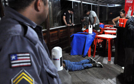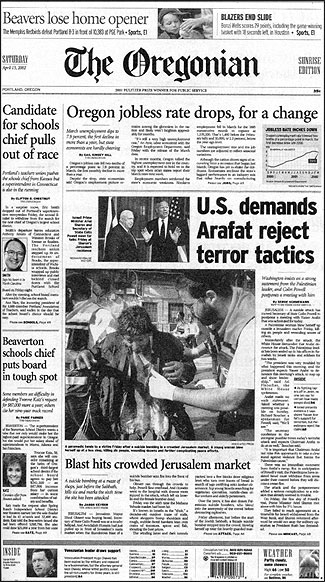
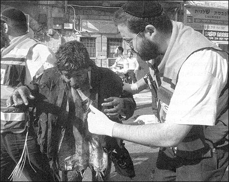
An explosion at a Jerusalem market, triggered by a suicide bomber, leaves the street littered with debris and body parts. Among the wounded, a rescuer assists a man whose clothes are shredded and charred from the blast. In Ramallah, a Palestinian soldier sprints across a street and, in public view, is shot by an Israeli sniper.
On The Oregonian’s front page, we run a photo of this market victim, picked up by The Associated Press, as the main picture. It shows little blood or gore, but it’s a powerful image, graphic in its depiction of the trauma and terror. From the West Bank, two AP photographers record a sequence of the Palestinian’s death as it happens, and we decide to publish a single image taken at the moment the man takes a fatal hit. This photograph runs black and white and toward the bottom of a page, inside the paper. It’s a haunting photo but not particularly graphic or as unsettling as it would have been had we run the entire shooting sequence in color on the front page.
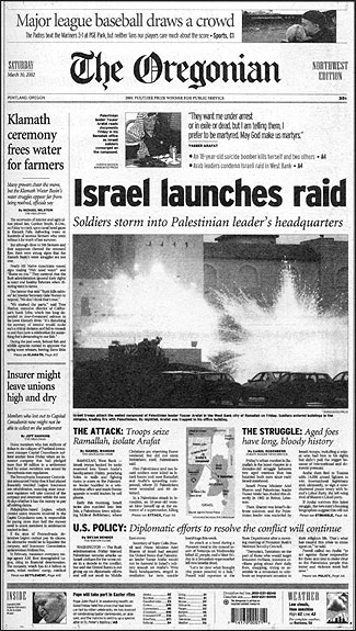
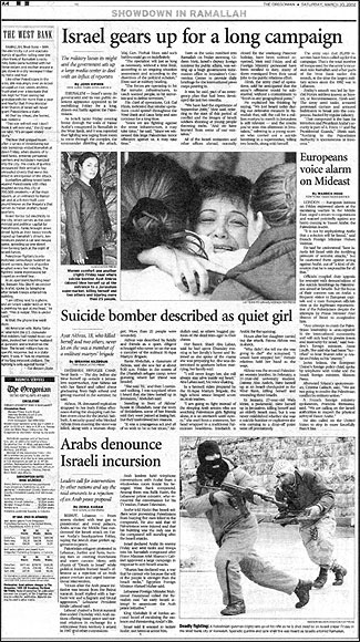
Front page, top, of The Oregonian on Saturday, March 30, 2002, and Page A4, of the same day’s paper showing our Mideast coverage, including the photo of a Palestinian gunman killed by an Israeli sniper. —R.R.
RELATED ARTICLE
"Portrait of a Death"
- Randy RasmussenNews reporting on the conflict between Israelis and Palestinian draws reader comment like few other topics. Add to that the fact that images of violence set phones ringing immediately and know that the response to our front-page image was rapid and vigorous. (We rarely hear from readers about photographs that appear on inside pages.) About the market victim photo, we received comments such as: “I can’t handle it.” “It is more than I need to see.” Another caller complains: “I’m tired of seeing blood and guts.”
I’ve heard many comments about photographs that we’ve published during this resurgence of violence in the Middle East. And I have developed a pretty good sense of what aspects of our work tend to draw the most reader reaction. They include:
- Where the photo is played. Photos played on the front page, in full color, receive the most attention and generally the most reaction. Inside photos seldom evoke the same kind of commentary.
- How it is played. Again, the most prominent pictures on the page get the most reaction. Color is also a factor.
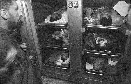
- Depiction of violence. Peak action, depicting violence and captured in a still photograph, gets the most reader comment, followed very closely by scenes showing dead bodies.
- Evidence of violence. Body bags, pools of blood, or other graphic remains often are viewed as traumatic.
- Intrusion into scenes perceived as private. This could be anything from reaction at a suicide bombing to a grieving family member at a funeral, scenes where strong and candid emotions are laid bare.
- Perception that one side is favored over the other in coverage. The Oregonian’s public editor, Dan Hortsch, who often first receives reader phone calls, likens the Mideast conflict to the 2000 Gore-Bush election, in which each side strongly believed its candidate was being slighted in the coverage.
Each of these factors contributes to difficult decisions for editors who must decide how to document a news story that is often best portrayed by pictures of violence, even though they know these images will evoke strong emotions.
At The Oregonian, where I work as a photo editor, we rely on questioning and discussion when confronted with pictures that contain bodies or gore or might be viewed as intrusive. Our general directive is to not run these photographs. However, each picture must be talked about in the context of its news value and its merits understood. These discussions take place first among those in the photo department, then move outward to include the senior editor for visuals, our design director, and the managing editor for news.
What follows are some of the questions we try to answer to determine if we should publish particular photographs and how we might use them:
- Are these images storytelling, documentary photojournalism? We want spontaneous photography that reveals the news quickly and truthfully.
- Are the photographs well executed? We look for well-composed photos that reflect sophisticated use of lenses, angle and lighting.
- Are they powerful and dramatic without being gratuitous in their depiction of violence?
- How do they relate specifically to the news of the day or define the event in a way that gives greater understanding to the long-running story?
- What are the possible consequences of running the photos? What reactions might they provoke? And what will be the good that can come from publishing them?
- What is the day’s competition? Other news events might push a strong photo downpage or inside, as sometimes we make difficult decisions on where to place a photograph. (The photograph of the man killed by the sniper was taken on the same day that Israeli troops razed Arafat’s compound, and a suicide bomber—only the second woman to do this—killed herself and two others. That day, story and photo competition was quite stiff.)
These questions define what I call an invisible “bar,” one that dictates whether a photo will make the front page, an inside page, or be rejected.
Often, even after all of these questions have been raised and discussion has led us to think hard about many considerations, readers will still react negatively to our decision. But knowing this reaction might come should not dissuade us from publishing images that we think offer readers a vital newsworthy perspective on this long-running conflict.
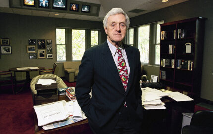
The newspaper has a long history of not running photos of the bodies of dead people. John Harvey, a senior editor who heads the national/international news team and a veteran of 40 years at the newspaper, remembers that one publisher, seeing a photograph of Marilyn Monroe’s draped body in an early edition of the paper, had the picture pulled from later editions. The Oregonian did, however, run the haunting photo by George Wedding of a dead child’s body in the back of a pickup truck after the eruption of Mount St. Helens. “I handled 500 calls the next day,” Harvey remembers.
During my earlier years at the newspaper, decisions about whether to publish pictures of violence often felt as though they were made randomly. Even the factors that went into the decision-making did not seem well understood by the staff. That changed with the arrival of Sandy Rowe as editor of The Oregonian in 1993. Rowe created a systematic structure in the newsroom that changed the way editors looked at story play and picture selection. Rowe orchestrated the creation of an open meeting room called the “Well,” a space specifically designed to encourage discussions about what the newspaper is doing and how it has done. Each day’s papers are posted on walls that can be opened, and etched-steel panels remind the staff of the newspaper’s mission statement.
Each weekday morning, editors gather in the Well. Here the next day’s stories are discussed, but editors and others also offer reaction to the morning’s edition. If a particular picture or story has evoked reaction, it might result in spirited conversations. Occasionally we show photographs that were not published and talk about whether that was the “right” decision. As Rowe puts it: “We try to walk around our decisions and view them through different prisms. We want to hear different views and be challenged.”
An understood partner in this decision process is the reader. Since Rowe came to the newspaper, we have opened ourselves up to the reader. Now on the first page of every section a phone number is published for the editor responsible for that section. Stories end with e-mail and phone information so readers can reach the writer and, often, the photographer. We have created the position of a public editor, a direct liaison between the public and the newspaper.
The Mideast conflict, Rowe observes, involves events of unquestioned significance and events over which people vigorously disagree. Readers whose sympathies fall to one side or the other see things quite differently. The Oregonian often becomes the focus for their reactions, as we report and display photos they perceive as unfair or too emotionally disturbing.
In selecting pictures from the Middle East, we are sensitive to issue of fairness and our overall goal is to achieve an accurate historical perspective. In this process, editors try to emphasize news over emotion, to edify rather than enrage. At the same time, Rowe reminds us that with the ongoing violence, we need to be careful not to sanitize the situation at the risk of not showing reality. Rowe cautions editors to remember: “Our job is to add light, not heat.”
Randy L. Rasmussen is assistant director of photography at The Oregonian.
