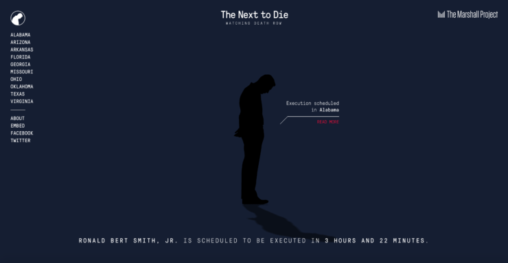
A man in silhouette, head bowed, stands against a gray background. A dark shadow extends below the silhouette, and the chilling words underneath proclaim in simple white type: “Ronald Bert Smith, Jr. is scheduled to be executed in 7 hours and 48 minutes.” The clock counts down in real time, and as the date of the execution nears, the background darkens and the shadow lengthens.
This is The Marshall Project’s “The Next to Die” homepage. Click on the red “Read more” link, and a summary of this Alabama case by an Alabama Media Group reporter appears. An update shows Smith’s execution is temporarily stayed—twice—so the U.S. Supreme Court can review a request by Smith’s attorneys to reconsider the case due to alleged constitutional flaw’s with the state’s death sentencing law, but the requests are ultimately denied, and the execution proceeds. Smith is declared dead shortly after 11 p.m., so another name replaces his on the homepage: “Christopher Wilkins is scheduled to be executed in 1 month, 2 days, 11 hours and 2 minutes.” The names change in real time, but the page’s stark design remains constant.
Former managing editor Gabriel Dance came up with the idea with managing editor Tom Meagher. Dance designed the site, while Meagher recruited local news organizations to provide context and a backstory for every execution in the United States. The simplicity of the design—a person in the middle of the page and nothing else around it—conveys the emotional weight of each execution, without taking a political stance on capital punishment. Scroll down, and a stylized map in lighter and darker hues of red depicts states by number of executions. Reporters from around the country can log in and update the site with new names, states, and execution times. “The Next To Die” also has its own Twitter feed that users can follow for updates.
The Marshall Project, which reports on the criminal justice system, this year tied with Quartz as the “World’s Best Designed Website” in the Society for News Design competition. Judges praised the investigative start-up’s website as “audience-first design at it’s best" and “The Next to Die” project in particular for “using a social channel to inform on important, timely problems, while also appealing in its design to the underlying data in a way that moves you with its clarity and simplicity.”
The final product is more than a piece of reporting. It’s data visualization as interactive tool, and it sits squarely at the intersection of storytelling, technology, and design, says Mario García, one of the media industry’s top design consultants. “Design, in the era of the journalism of interruptions and mobile platforms, is that which lures us to content,” says García, whose consulting firm has worked with more than 700 media companies around the world. “We are no longer just manipulating and presenting content but also helping to imagine new ways to deliver it and new ways to make money from it. All of this for the same old goal: Reach the audience and compel them to give a damn.”
Increasingly, the old newsroom adage “show, don’t tell” is being taken literally
Design has always been crucial to the presentation and the reception of news. But with 72 percent of Americans consuming news on a mobile device, up from 54 percent three years ago, according to a recent Pew Research Center report, the visual aspect of journalism has become increasingly important. In addition, the proliferation of platforms—from Facebook to Twitter to Snapchat to WhatsApp, not to mention a publication’s own print product and website—means that one-size-fits-all designs just don’t work. In this environment, newsrooms are compelled to integrate designers from the very start of projects, rather than dumping pictures and text on their desks after the story has already been written. “One of the reasons we got caught so flat-footed [by the digital opportunities for journalism] was that we were treating designers and coders as people who just put our stories up on the web, instead of people who might change the whole way we conceive of our mission,” says Nicholas Lemann, Columbia Journalism School dean emeritus and a New Yorker staff writer.
Bloomberg News no longer treats design as an afterthought. David Ingold, a graphics reporter, is part of a team that includes computer programmers and coders as well as more traditional designers. Team members not only illustrate other people’s articles, but also come up with their own story ideas. “There used to be a word person or a graphics person or a photo person, but those divisions don’t really exist anymore,” Ingold says. “We’re all kind of freed up to do anything.”
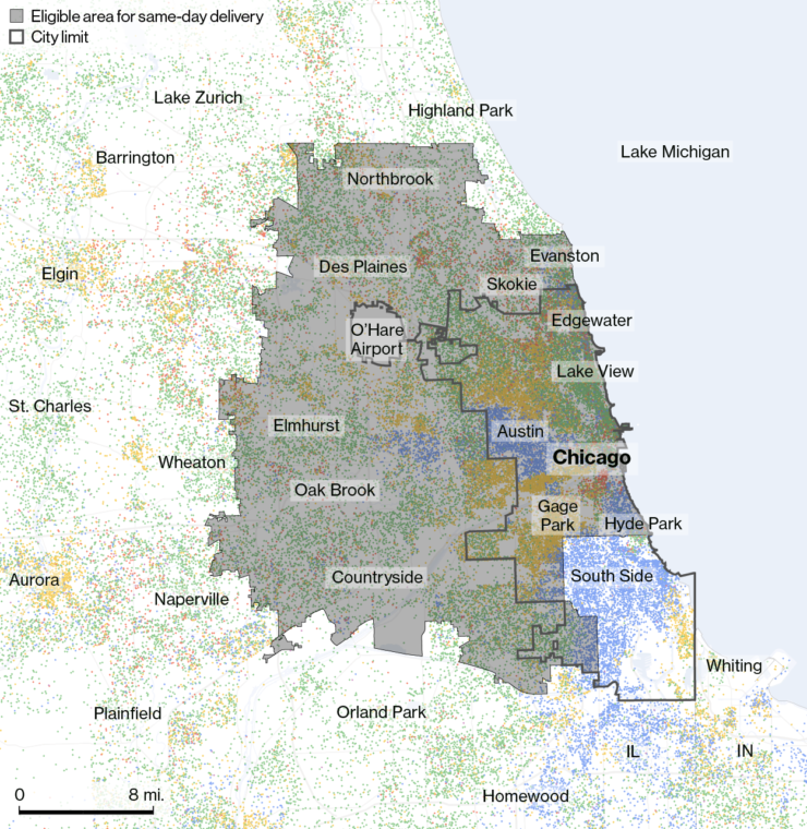
That freedom let Ingold follow his reporting instincts to examine Amazon Prime’s free same-day delivery service. He began by simply fulfilling a reporter’s request for a map to accompany a November 2015 feature story about last-minute holiday shopping. The piece focused on how procrastinators could buy gifts on Amazon and get them delivered the same day. The map needed to show areas around the country where delivery service was available.
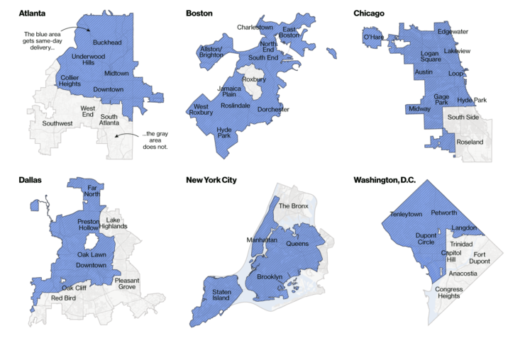
To create the graphic, Ingold teamed up with Adam Pearce, a coder who now works at The New York Times. They devised a program that automatically logged every U.S. zip code into Amazon’s zip code entry box, then overlaid it with U.S. Census Bureau data. After the original map ran, Ingold began noodling with the data—starting by putting in Chicago’s zip codes—and found that some parts of the city got same-day delivery and some didn’t.
“It took about five seconds of looking at the Chicago map to see there was something funny about it,” Ingold says. They then looked at other big cities, such as Washington, D.C., Boston, and New York City, and realized: “They were not delivering to black people.”
They ended up with a story, “Amazon Doesn’t Consider the Race of Its Customers. Should It?”, and a series of accompanying maps. Amazon didn’t respond to email and phone requests for comment about the article. The maps depicted Atlanta, Boston, Dallas, Chicago, New York City, and Washington, D.C., with shaded areas showing Amazon’s same-day service area and islands of blank space where it didn’t deliver. Those blank spaces represented the zip codes of predominantly minority neighborhoods. Within days, under pressure from elected officials, Amazon expanded service to Boston’s Roxbury neighborhood, and soon after, to the Bronx in New York City and Chicago’s South Side, two neighborhoods that had been excluded. (The population in the Bronx is 55% Hispanic and 43% African-American; the South Side is overwhelmingly African-American.) Ellen Pollock, who at the time was editor of Bloomberg Businessweek, says that, without the map, the story would have garnered far less attention: “You have to see the graphics to really understand what’s going on.” (Since the Bloomberg story was published in April 2016, Amazon has significantly expanded their coverage area and now delivers to all the areas previously excluded within the six cities investigated in the article.)
Increasingly, the old newsroom adage “show, don’t tell” is being taken literally: As newsrooms grapple with overwhelming troves of raw data, a graphic or map can often tell a story better than words. But the same technology that allows data journalism to flourish also creates new challenges for presentation.
When data journalist Moiz Syed was working for The Intercerpt on an investigation into water contamination near military sites, he had to merge complicated data sets from the Environmental Protection Agency and the Department of Defense. The project, written by health and environment reporter Sharon Lerner and called “Poisoning the Well,” chronicled how products laced with perfluorinated chemicals (PFCs)–including toxic firefighting foam often used to train personnel to put out airplane fires at U.S. military bases–had contaminated drinking water. Syed’s mission was to illustrate this trend for the online investigative news site and make it feel accessible. He decided to create an interactive map that let readers find the levels of contamination in their own communities just by holding their cursors over the map. He could have saved days of work by merely presenting a color-coded map, but it would have lacked the same emotional power. “To make sure that our readers understand the gravity of this story, they had to find themselves within that data set,” Syed says.
Syed stresses the importance of “user onboarding,” which refers to the process of helping users feel at ease with new digital products. Apple pioneered this approach of creating intuitive and user-friendly technology with its consumer products. In visual journalism, exploring new ways to tell a story often means presenting information in a way that may be unfamiliar to the audience. Syed says data journalists must ‘”empathize with users and understand how they will be interacting with information” so the audience can focus on the story and not on the mechanics of a novel presentation. He cites a Bloomberg News animated graphic on climate change called “What’s Really Warming the World?” It works so well, Syed says, because the graphic takes the reader step-by-step through the piece.
The link between audience engagement and good design has never been stronger
The “What’s Really Warming the World?” graphic begins with a fever chart showing how much the world has warmed between 1880 and 2014. Click on the big arrow at the bottom of the screen, and a new question appears: Is It the Earth’s Orbit? A second fever chart showing the effect of the Earth’s orbit on world temperature rolls out through animation, but doesn’t cross the warming line; it’s clear the answer is “no.” Sun? Volcanoes? Deforestation? The questions keep appearing, and the graphics keep showing that these factors have had little effect of global warming. Finally, this headline appears: “No, It Really Is Greenhouse Gases,” as an animated fever chart rises above the world temperature line. The next headline brings the user even closer into the piece with an invitation: “See For Yourself.” The user can then highlight each possible cause individually by clicking on rectangles of different colors.
Syed says this type of design is essential for audience engagement because “it’s actually teaching users how to read the piece. If you don’t do that, you lose them.” Bloomberg’s own tracking seems to back up this assertion: According to a Bloomberg spokesperson, the graphic was the most read article in 2015, with 89 percent of the views coming through social media.
The link between audience engagement and good design has never been stronger, and it’s becoming ever more crucial to commercial success in the digital age. “The absolute single word that would connect up design and business performance is engagement,” says news industry analyst Ken Doctor, founder of the Newsonomics website.
Legacy media outlets still make most of their money through advertising and subscriptions. In a crowded online marketplace vying for readers’ attention, gripping design can foster audience engagement, which can lead to more revenue. Still, the relationship between engagement and revenue is difficult to gauge because media companies generally don’t release that information. Amy Mitchell, director of journalism research at the Pew Research Center, says tracking the effects of audience engagement is confusing because the industry hasn’t adopted a standard definition of engagement or a standard way to measure it.
Print media tracks circulation, and television news uses ratings, to tout their audience to advertisers. Now, digital news organizations that started out measuring “clicks” or “page views” have started timing how long a reader spends on a website, says Sachin Kamdar, CEO of Parse.ly, a data analytics company with clients that include The Huffington Post, Condé Nast, Mashable, New York Daily News, and Slate. This metric, called “engaged time,” shows advertisers that a site can deliver a loyal audience that is reading an article, not just clicking on it. According to a Parse.ly report, readers spent a median time of 46 seconds on major news and lifestyle stories and a whole minute on science and technology news. “Fourteen seconds may seem insignificant,” says Kamdar, “but for advertisers, that’s a lot of time per article.”
Color, typeface, and placement on the screen can entice a reader not only to click on a story, but to linger over it. Kamdar cites Slate, which redesigned its site a few years ago to make it less cluttered and more recently instituted “infinite scroll.” Infinite scroll displays an article on a single page so that the reader doesn’t have to click to move forward; when the reader reaches the end of one story, another story immediately appears below it. In a March 2016 blog post about Slate’s design changes, David Stern, director of product development, said Slate was prioritizing “time on site” over “page views” so that users would be “more likely to view more ads while they’re reading, they’ll be more likely to share our content, and they’ll be more likely to join our membership program.” Stern said that infinite scroll increased the time a test group spent on the site by 9 percent.
Columbia Journalism School recognizes the relationship of design to engagement by requiring students to learn how to use social media not only for reporting and publishing but also for audience building. “We believe it’s a game changer so it has to be taught at the same time as we are teaching the fundamentals of reporting,” says Sheila Coronel, the school’s dean of academic affairs. The reason is simple: economic viability. As news becomes “unpackaged” and consumed individually, “each article is on its own, traveling around in cyberspace, and you have to find an audience for it,” according to emeritus dean Lemann.
Benefits to a design-thinking mindset are both commercial and journalistic
Espen Egil Hansen, CEO and editor in chief of Norway’s Aftenposten, has spent much of the last year thinking about the connection between audience engagement, journalism, and design. He enlisted García to help him “rethink” the 157-year-old daily. “From a design perspective, what we have been working with for the last 20 years is not good enough,” Hansen says of the paper’s website.
In the past, a reader would seek out a trusted newspaper and its content. Now, the content has to find the reader. Only 60 to 70 percent of readers enter the Aftenposten site through its homepage, Hansen notes. “You cannot design and try to create a product anymore,” he says. “Each atom of content is actually the design.”
To put into practice this new way of thinking about news presentation, Hansen redeployed his design staff. He moved a group who spent most of its time designing the static front page into a group aimed at designing individual articles for Facebook. He used audience research data to figure out what happened to the people who first encountered Aftenposten through Facebook. The goal was to see if giving users a free taste would lead them to the full website, where they could become subscribers. Hansen says the new emphasis broke a 17-year subscription decline and resulted in a 9 percent increase in subscriptions over the past year: “It gave us the confidence that we could actually be radical in throwing content out there and still get people to pay.”
Hansen now thinks of his job as producing “millions of front pages every day” while working toward a goal of personalizing a front page for each reader. “We still have many newspaper editors who come to work thinking primarily of tomorrow’s newspaper,” García says. “That’s the kiss of death. Think of the next 15 minutes.”

Heather Chaplin, the founding director of The New School’s “Journalism + Design” program, suggests the Silicon Valley staple of “human-centered” design thinking can help refocus a news industry disrupted by technological change. She credits Jamer Hunt, associate professor at the Transdisciplinary Design Program at Parsons, for this definition: “Human-centered design starts with the premise that you as the designer don’t have all the answers,” she writes in a paper published in July by Columbia Journalism School’s Tow Center for Digital Journalism. (This past fall the New School received $2.6 million to expand its Journalism + Design program to other journalism schools.)
Design thinking, according to a guide published by the Institute of Design at Stanford, comes down to five steps: empathize, define, ideate, prototype, test. Essentially, that means before embarking upon the physical task of designing something, you begin an intellectual exercise of understanding the user’s perspective. That perspective becomes the driving force behind your design. The process involves iteration: quickly sketching out ideas, then offering them to users for their input, then changing the ideas until you come up with something that works.
Chaplin cites benefits to a design-thinking mindset that are both commercial and journalistic: testing new products before committing resources; improving journalism by being more attuned to readers’ needs; and working directly with communities in “civic journalism” projects that are relevant to people’s lives. “The idea of designing along with stakeholders resonates strongly with the work being done in journalism today under the label of audience engagement,” she writes in the Tow paper. “Audience engagement is more than just a marketing ploy. It’s the acknowledgment of a shift in power dynamics.”
Says The New York Times’s Dance: “Instant communication between people has essentially turned journalism into a conversation.”
As executive editor of digital for The Guardian in London, Aron Pilhofer experienced firsthand the power of audience-centered thinking when he designed coverage of the 2015 British general election. Newsroom leaders invited a user-experience team to research what people actually wanted from election coverage. “It totally changed how we designed around the election,” says Pilhofer, a former editor of digital strategy at The New York Times and now a journalism professor at Temple University.
For example, The Guardian’s team members started out thinking they would kill what they thought of as a boring, reductive question-and-answer issues grid for candidates. Audience research, however, showed that voters actually found the grids helpful. Still, readers of different ages had different interests. The solution: an interactive graphic called “What Are The Parties Offering You?” that could be customized based on factors such as age, family status and living situation. Readers could enter their data and the graphic would display policy positions relevant to their concerns. “The lesson we took away from that,” Pilhofer says, “is that when you actually start from the proposition, you’re there to help to solve problems for readers and you actually ask readers, magic occasionally happens.”