Photojournalism is changing, propelled by newsroom budget cuts, multimedia possibilities, and the ubiquity of digital images. In Visual Journalism, photojournalists write about emerging digital business strategies and their efforts to expand the reach of their photographs online and on gallery walls. They also share ideas about how to fund projects of personal passion and societal value. Their words tell vital stories about how they do their work; slideshows of their photographs—exclusive to our Web site—and multimedia presentations convey their visual stories. Read and watch as the future of photojournalism unfolds.
RELATED ARTICLE “Digital Stories Are Being Chosen and Consumed à la Dim Sum” - Michele WeldonMy students’ assignment seemed straightforward: take a front page of a newspaper and translate it into a Web site’s home page using InDesign. In a week focused on visual storytelling, this was our third exercise.
Here is one lesson I learned in watching them do this: The package of print content that appears under an umbrella brand with stories complementing each other in approach, gravitas and subject is no longer relevant when the Web site design is involved. For many of my students, stories exist in isolation.
Some of my students certainly created a fresh digital approach that could draw in a few more eyeballs. But others didn’t have a clue about what stories they’d put where or why. They plopped this there and that here, and in the end they left out most of what had been on the front page. It was as if they were putting together a jigsaw puzzle in the dark. Most concentrated on one story as their focal point—without any discernible sense of connectedness or cohesiveness.
Perhaps my notion of news as a mix of stories has no grandfather clause. Today students think of stories as separate entities of information to be clicked to and through until they have clicked enough. From one story they move to the next one, not even heading to the next Web site or blog or even to their favorites list.
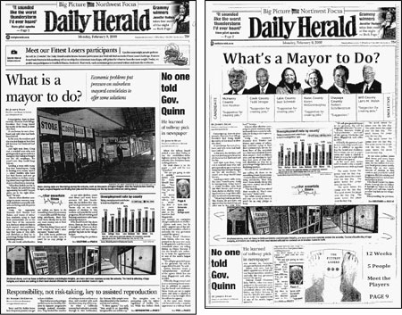
Weldon asks her students at Northwestern University’s Medill School of Journalism to remake a newspaper’s front page. (Original on left, redesign right.)
Visual Design: Old and New
In week seven of an 11-week required course, Reporting & Writing the News (designed for freshmen who are journalism majors and potential journalism school transfer students), we—the seven lab instructors and I—focus on the basics of visual design for print and the Web. As lead instructor, coordinator and creator of the assignments for the dual courses of Reporting & Writing and its required follow-up, Multimedia Storytelling, I attempt to lay the foundation for the journalism basics of what they will need to know and can master over the next few years and beyond.
Following an overview lecture by my colleague, assistant professor Susan Mango Curtis, a visual design expert and creative life force, students dissect a front page of a newspaper and redesign it. Using the principles of news judgment, we ask them to literally take the paper apart—to rewrite headlines, find new photos, enlarge or shrink existing photos, eliminate stories, shift emphasis on stories, add cutouts and extras such as weather boxes or teasers, and even redesign the banner.
They do this using scissors, paper and glue. Having them use tactile elements in this two-hour lab assignment is intentional. Without the distraction or ease of a program such as InDesign, they work with the layout until it seems just right.
The second assignment, as homework, is to choose a single feature story online and make it an entire page of a print features section. Having this additional time, they find great photos, illustrations or refashion headlines to melt into, bob around, or surround the text.
This part they get. It is the next part in the triptych that didn’t seem to work so well for them—or us. After a walk-through with our technical staff in the basics of InDesign, students were instructed to do the following:
Create a Web page from an existing newspaper print page that you find on newseum.org. Before you begin, read the stories and study the content. Then you will want to sketch out a storyboard for the Web page so you can have an idea for the final product before you start working. Take some risks and try some new approaches. Keep some of the content the same, but adjust the look to a Web site from a printed page. Do not just reproduce the printed page in a horizontal format.
In my lab of 16 students, more than half took one of the stories on the front page and refashioned it to become the central—or organizing feature—of the Web page. If there was a story on a candy manufacturer, the Web page looked like a home page for a candy retailer.
When I saw these results, I sensed at first that I had failed to incorporate caveats on how stories can accompany other stories and share visual space without risk of attention annihilation. After a bit more time passed, I realized that the assignment had failed because I didn’t understand that many of my students simply don’t see news presentation in the ways that I do. And I realized then that perhaps in this assignment they were teaching me something about the future of digital media and the notion that each story is its own whole.
Seems to me this is the start of an entirely different and deeper conversation. And it is one I welcome.
Visual Journalism
Photojournalism is changing, propelled by newsroom budget cuts, multimedia possibilities, and the ubiquity of digital images. In Visual Journalism, photojournalists write about emerging digital business strategies and their efforts to expand the reach of their photographs online and on gallery walls. They also share ideas about how to fund projects of personal passion and societal value. Their words tell vital stories about how they do their work; slideshows of their photographs—exclusive to our Web site—and multimedia presentations convey their visual stories. Read and watch as the future of photojournalism unfolds.