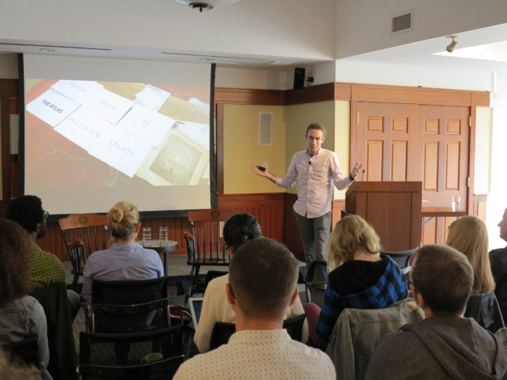
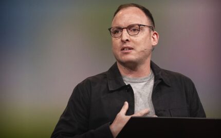
Zach Seward is senior vice president of product and executive editor at Quartz, the business news site owned by The Atlantic’s parent company. Quartz became profitable in 2016, its fourth full year of operation. Year-over-year revenue increased by 60 percent, no small feat for a company that relies heavily on advertising. Since launching in 2012 with a mobile-first website, QZ.com, and the Daily Brief email newsletter, Quartz has added Quartz India, Quartz Africa, an app, podcast, events, open-source tool Chartbuilder, and the chart-sharing platform Atlas. Seward—who previously helped launch the Nieman Journalism Lab before joining The Wall Street Journal as editor of outreach and social media—leads the teams responsible for product development, audience growth, and data visualization. Quartz, which recently hit a new traffic milestone of 20 million unique monthly visitors, has around 210 employees, with 110 of them based in New York.
During a recent talk at the Nieman Foundation, Seward discussed editorial obsessions, Quartz’s texting-based mobile app, and writing for a global audience. Edited excerpts:
[Quartz’s origins] had to do with our seeing a space that, by The Economist and The Financial Times in particular, we thought had been left open. They had excellent coverage of global business news, but hadn't aggressively gone after audiences online, hadn't aggressively gone after digital advertising in the space of global business news. We saw it laying there, and four and a half years on, that has proven right.
The tagline we came to adopt was “Quartz is a guide to the new global economy for business people who are excited by change.” We are a news website—I won’t try to claim otherwise—but from day one, we had thoughts about how we could build a news organization that wasn’t solely defined that way, that could express what a guide to the new global economy is in a variety of ways, a website being just one of them.
Rather than the traditional view of a news organization, which would put its print product or its website at the center and then perhaps have extensions, we were thinking of Quartz with the brand at its center, and we could create extensions from there. The first two of which were, of course, our website, QZ.com, and our morning email, the Daily Brief.
As we’ve grown, we’ve expanded that into a variety of product offerings. We added events, we did a podcast (and then killed the podcast). We launched a charting platform called Atlas. We added a video operation, then very quickly that exploded. Then we launched an app last year.
The core strategy is there’s a brand called Quartz. It has certain immutable properties. We cover global business news. We write for an audience that cares as much about the world far beyond where they are as what’s right in front of them. We focus on the user experience heavily in everything we do.
Each of the products we launched started from a fundamental thesis, an idea we had about how to express journalism on this platform. It gave us a lot of conviction about how, with each new product or platform, we are trying to express Quartz’s journalism in a different way. You could try to just take the same content and apply it in each of these places, but we decided not to do that. It’s the harder, less efficient way of doing things, but has a few distinct advantages.
By year one, when the Daily Brief was starting to get traction, a lot of readership, I’d start to meet people and tell them I worked at Quartz. [They’d say,] “What a great email. Thanks so much.” I realized they are completely unaware that we are anything but an email. They just read the Daily Brief. That was a little disconcerting at first, frankly, but then something we grew to embrace. More recently, as we grew our offering of products, we could be other things as well.
We were really vocal in 2012 when we launched about not wanting to do a native app, so why, in 2015, did we decide to start working on one? This was the main thesis: If we were going to do an app, we should re‑think it. If you’re not familiar with the app, it presents the news in a totally different way than most news apps, it’s what’s commonly known as a conversation interface. Some of you may know it as pseudo text messaging.
The genesis was that we thought that there was an opportunity to do notifications for news that were better than what existed at the time. In the time since that point, a lot of news organizations have gotten clued into this, and I think notifications from news organizations have, in general, gotten a lot better than they used to be.
We got into the idea that well, maybe the whole thing is just messages. Some of those messages come to your lock screen in the form of notifications, and you can just leave it at that. If you’re more interested, you can come inside the app and it’s still more notifications, all in the same visual metaphor that we’re used to from our messaging apps.
There were three conclusions from the prototype we built. First was that you could do it. The second was this was not just a novelty—not only you could do it, but it was kind of fun to go through this kind of an interface for the news. The third was that, if we’re going to do this well, we would have to write completely fresh content for it because this version of it was lifeless, as far as the journalism went. In order to prototype it, we were using some content that we were already producing for the website. It just read as though we were re‑purposing that content. You could tell it wasn't related to the idea that you were going back and forth in a text messaging interface with us.
We knew we had something that we liked in terms of an interface, but we wanted to do it well, [so we knew we were] going to have to build a whole team dedicated to writing and then rewriting the news constantly, which is obviously a fairly large investment.
It was a really fun project to go through. For me, it was this great marriage of why I like thinking about product and editorial at the same time. You can make all the fancy chat bubbles you want, but they are nothing without really great writing in them and vice versa.
This is not the fastest way to get the news. We would never claim the Quartz app is the quickest or most efficient way to catch up on what has happened today. If it’s not that, it’s got to be some other things.
One thing it tries to be is the most entertaining. It’s quite informative about the news, but it is also an entertainment experience. The four or five minutes it takes to go through a complete script is intended to fit into those moments in your day waiting around for something to start or in the elevator.
Putting a heavy focus on the entertainment value of it was really crucial, as is adhering to the metaphor that we picked in the first place of text messaging, using the kinds of material you would expect to receive that way—so short and pithy writing, emojis and gifs, anticipating the reader’s questions.
When you start to do that, you actually do start to construct interesting experiments that are distinct from writing a linear story. You can also inject a lot of personality into the writing.
Our newsroom is organized around this notion of obsessions as distinct from beats. On bad days, “obsession” is just a glorified word for beat. On good days when we’re upholding that notion, it’s quite different.
We’re not trying to divide up the whole world into coverage areas to make sure that the sum of its parts equals the totality of all that’s going on in businesses, but instead trying to pick some areas we think are particularly important. Our oldest obsession is called “The Next Billion,” about the next billion people to come online for the first time, largely on their mobile phones.
That of course is a tech story, but it also is a mobile payment story and a health story, and our perception was that, in some newsrooms, that’s a more difficult story to cover because there’s the health reporter, the payments reporter, and the tech reporter, and they’re in different bureaus, and they’re not aligned on coverage so you're missing what’s actually interesting and important.
That’s how we try to approach our coverage. If we’re competing against FT and The Wall Street Journal and so on, but with an editorial staff that’s smaller than them, it behooves us to pick our spots, and obsessions is a good way to do that.
Almost all of our revenue is advertising. It’s a specific kind of advertising, which is custom. A big bet we made at the beginning was to eschew IAB [Interactive Advertising Bureau] standard ads. They were the ones who made famous the 300x250 box that everybody hates and the banner ads.
We were a little naïve about it at the time—we were like, “to hell with that, we’ll do our own custom units.” The guy who invented our main ad unit, the engage ad, our first engineering director, couldn't hate advertising more—I love the irony of that, because that unit became our bread and butter.
It’s been really successful for us. If you’re an advertiser you come and work with us, not just to reach our audience. You are also working with us to create the ad in the first place, create a strategy for it, and we charge accordingly.
The ad strategy is basically very high‑end advertising that we try to make as effective as possible. There are those displays ads as well as native advertising throughout the site. The website is the biggest source of ad revenue of all the products that I’ve mentioned. The Daily Brief and the app are the other two significant sources of revenue.
Our audience is currently 50 percent in the U.S. and 50 percent outside the U.S. We didn’t know [what audience we were primarily targeting] when we launched, except that we wanted to be an English‑only, but very global, news outlet.
There are certain areas outside the U.S. that have grown really quickly for us. One is Europe in general, the U.K. specifically. Last year in particular was a big year for us, both in terms of growing audience there and revenue. Something like a quarter of our revenue last year came out of our London office. For an American news outlet, that’s not typical.
India also has been a huge source of growth. Maybe three years ago now, we launched Quartz India. It’s an edition of Quartz targeting both English speakers in India as well as people in the rest of the world who are particularly interested in the country. We did the same with Quartz Africa more recently.
We’re a global news organization, and we’re writing for a global audience. We’re going for readers who care about the whole world, think the world’s better as a more open and connected place.
During a recent talk at the Nieman Foundation, Seward discussed editorial obsessions, Quartz’s texting-based mobile app, and writing for a global audience. Edited excerpts:
On filling a gap
[Quartz’s origins] had to do with our seeing a space that, by The Economist and The Financial Times in particular, we thought had been left open. They had excellent coverage of global business news, but hadn't aggressively gone after audiences online, hadn't aggressively gone after digital advertising in the space of global business news. We saw it laying there, and four and a half years on, that has proven right.
The tagline we came to adopt was “Quartz is a guide to the new global economy for business people who are excited by change.” We are a news website—I won’t try to claim otherwise—but from day one, we had thoughts about how we could build a news organization that wasn’t solely defined that way, that could express what a guide to the new global economy is in a variety of ways, a website being just one of them.
On how Quartz thinks about product
Rather than the traditional view of a news organization, which would put its print product or its website at the center and then perhaps have extensions, we were thinking of Quartz with the brand at its center, and we could create extensions from there. The first two of which were, of course, our website, QZ.com, and our morning email, the Daily Brief.
As we’ve grown, we’ve expanded that into a variety of product offerings. We added events, we did a podcast (and then killed the podcast). We launched a charting platform called Atlas. We added a video operation, then very quickly that exploded. Then we launched an app last year.
The core strategy is there’s a brand called Quartz. It has certain immutable properties. We cover global business news. We write for an audience that cares as much about the world far beyond where they are as what’s right in front of them. We focus on the user experience heavily in everything we do.
Each of the products we launched started from a fundamental thesis, an idea we had about how to express journalism on this platform. It gave us a lot of conviction about how, with each new product or platform, we are trying to express Quartz’s journalism in a different way. You could try to just take the same content and apply it in each of these places, but we decided not to do that. It’s the harder, less efficient way of doing things, but has a few distinct advantages.
By year one, when the Daily Brief was starting to get traction, a lot of readership, I’d start to meet people and tell them I worked at Quartz. [They’d say,] “What a great email. Thanks so much.” I realized they are completely unaware that we are anything but an email. They just read the Daily Brief. That was a little disconcerting at first, frankly, but then something we grew to embrace. More recently, as we grew our offering of products, we could be other things as well.
On the Quartz app
We were really vocal in 2012 when we launched about not wanting to do a native app, so why, in 2015, did we decide to start working on one? This was the main thesis: If we were going to do an app, we should re‑think it. If you’re not familiar with the app, it presents the news in a totally different way than most news apps, it’s what’s commonly known as a conversation interface. Some of you may know it as pseudo text messaging.
The genesis was that we thought that there was an opportunity to do notifications for news that were better than what existed at the time. In the time since that point, a lot of news organizations have gotten clued into this, and I think notifications from news organizations have, in general, gotten a lot better than they used to be.
We got into the idea that well, maybe the whole thing is just messages. Some of those messages come to your lock screen in the form of notifications, and you can just leave it at that. If you’re more interested, you can come inside the app and it’s still more notifications, all in the same visual metaphor that we’re used to from our messaging apps.
There were three conclusions from the prototype we built. First was that you could do it. The second was this was not just a novelty—not only you could do it, but it was kind of fun to go through this kind of an interface for the news. The third was that, if we’re going to do this well, we would have to write completely fresh content for it because this version of it was lifeless, as far as the journalism went. In order to prototype it, we were using some content that we were already producing for the website. It just read as though we were re‑purposing that content. You could tell it wasn't related to the idea that you were going back and forth in a text messaging interface with us.
We knew we had something that we liked in terms of an interface, but we wanted to do it well, [so we knew we were] going to have to build a whole team dedicated to writing and then rewriting the news constantly, which is obviously a fairly large investment.
It was a really fun project to go through. For me, it was this great marriage of why I like thinking about product and editorial at the same time. You can make all the fancy chat bubbles you want, but they are nothing without really great writing in them and vice versa.
This is not the fastest way to get the news. We would never claim the Quartz app is the quickest or most efficient way to catch up on what has happened today. If it’s not that, it’s got to be some other things.
One thing it tries to be is the most entertaining. It’s quite informative about the news, but it is also an entertainment experience. The four or five minutes it takes to go through a complete script is intended to fit into those moments in your day waiting around for something to start or in the elevator.
Putting a heavy focus on the entertainment value of it was really crucial, as is adhering to the metaphor that we picked in the first place of text messaging, using the kinds of material you would expect to receive that way—so short and pithy writing, emojis and gifs, anticipating the reader’s questions.
When you start to do that, you actually do start to construct interesting experiments that are distinct from writing a linear story. You can also inject a lot of personality into the writing.
On editorial coverage based on obsessions versus beats
Our newsroom is organized around this notion of obsessions as distinct from beats. On bad days, “obsession” is just a glorified word for beat. On good days when we’re upholding that notion, it’s quite different.
We’re not trying to divide up the whole world into coverage areas to make sure that the sum of its parts equals the totality of all that’s going on in businesses, but instead trying to pick some areas we think are particularly important. Our oldest obsession is called “The Next Billion,” about the next billion people to come online for the first time, largely on their mobile phones.
That of course is a tech story, but it also is a mobile payment story and a health story, and our perception was that, in some newsrooms, that’s a more difficult story to cover because there’s the health reporter, the payments reporter, and the tech reporter, and they’re in different bureaus, and they’re not aligned on coverage so you're missing what’s actually interesting and important.
That’s how we try to approach our coverage. If we’re competing against FT and The Wall Street Journal and so on, but with an editorial staff that’s smaller than them, it behooves us to pick our spots, and obsessions is a good way to do that.
On Quartz’s advertising strategy
Almost all of our revenue is advertising. It’s a specific kind of advertising, which is custom. A big bet we made at the beginning was to eschew IAB [Interactive Advertising Bureau] standard ads. They were the ones who made famous the 300x250 box that everybody hates and the banner ads.
We were a little naïve about it at the time—we were like, “to hell with that, we’ll do our own custom units.” The guy who invented our main ad unit, the engage ad, our first engineering director, couldn't hate advertising more—I love the irony of that, because that unit became our bread and butter.
It’s been really successful for us. If you’re an advertiser you come and work with us, not just to reach our audience. You are also working with us to create the ad in the first place, create a strategy for it, and we charge accordingly.
The ad strategy is basically very high‑end advertising that we try to make as effective as possible. There are those displays ads as well as native advertising throughout the site. The website is the biggest source of ad revenue of all the products that I’ve mentioned. The Daily Brief and the app are the other two significant sources of revenue.
On writing for a global audience
Our audience is currently 50 percent in the U.S. and 50 percent outside the U.S. We didn’t know [what audience we were primarily targeting] when we launched, except that we wanted to be an English‑only, but very global, news outlet.
There are certain areas outside the U.S. that have grown really quickly for us. One is Europe in general, the U.K. specifically. Last year in particular was a big year for us, both in terms of growing audience there and revenue. Something like a quarter of our revenue last year came out of our London office. For an American news outlet, that’s not typical.
India also has been a huge source of growth. Maybe three years ago now, we launched Quartz India. It’s an edition of Quartz targeting both English speakers in India as well as people in the rest of the world who are particularly interested in the country. We did the same with Quartz Africa more recently.
We’re a global news organization, and we’re writing for a global audience. We’re going for readers who care about the whole world, think the world’s better as a more open and connected place.


