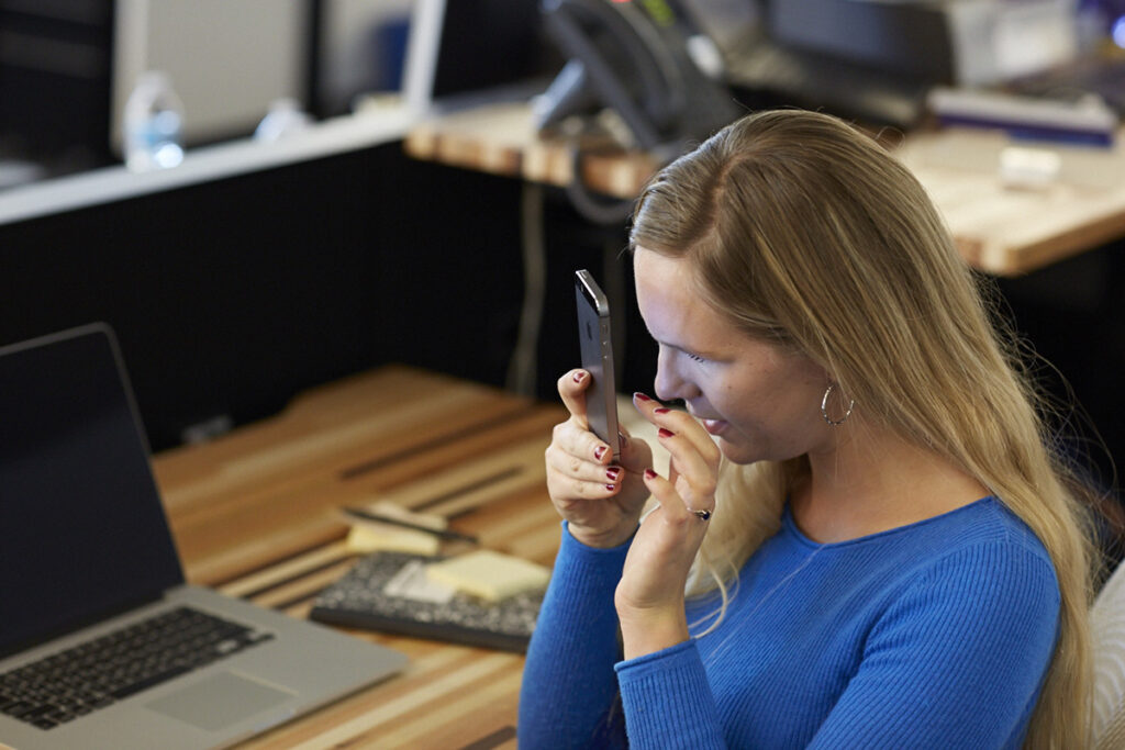
Elizabeth Campbell doesn’t see the Web; she hears it.
Campbell is blind and uses a program called JAWS that reads aloud the text on a Web page. The problem is, JAWS reads all the text. “I’ll be reading along and JAWS will start reading an ad right in the middle of a story,” she says. “A sighted person would see the same thing, but you guys can skim over it and skip the ad, where we have to figure out how far to go down so we can get back to the story.” The more ads, the more likely a site is to make JAWS crash.
Cluttered designs stuffed with ads and other graphics give JAWS problems, especially if a site isn’t programmed to make the text easy to interpret. So Campbell often tries a different browser. She might also use Apple’s VoiceOver software on her iPhone, pulling up the article on the Web or even switching over to the publication’s mobile app. Facebook is helpful because it makes text more accessible than many news sites and apps. As a last resort, Campbell, a general assignment reporter at the Fort Worth Star-Telegram, uses NFB-Newsline Online, a service of the National Federation of the Blind that reads news content aloud.
If that sounds like a cumbersome way to read an article, it’s also progress. “Even when I have challenges with access,” Campbell is quick to say, “it’s just amazing what we can do and what we can access as opposed to 30 years ago.”
According to Census Bureau surveys, nearly one in five Americans reported having a disability in 2010. Many are motor or cognitive disabilities, including dementia and depression. But more than eight million Americans are visually impaired, and more than 7.5 million have hearing issues. For people with disabilities, accessing the Web can devolve into the online bunny hop Elizabeth Campbell sometimes experiences.
While standards exist for creating accessible content online for those with disabilities, they are entirely voluntary for news sites. The Americans with Disabilities Act (ADA), a law requiring people with disabilities to be afforded equal access in public spaces, mandates things like wheelchair ramps, Braille signs, and handicapped parking. No such broad-based legal protections exist for the Internet. But for news organizations interested in reaching the widest possible audiences, and for journalists who see it as their mission to represent readers’ interests, ensuring equal access to online content is essential.
Campbell wants to see the government extend the ADA online, treating the Internet like a public space where companies must design sites the way they design buildings—to ensure access for people with disabilities. That means incorporating things like descriptive tags for photos, videos, and interactive graphics so blind people can know the context of a photo caption; adding closed-captioning to online videos so deaf people can follow stories, and creating basic page designs for the Web and mobile apps that make it simple for people with various disabilities to skip over images.
What if the Internet was treated like a public space that needed to ensure access for people with disabilities?
Outside the news industry, much of the core technology for accessibility already exists. For blind users, JAWS and other screen readers can read content anywhere on the computer, not just on the Web. Apple implements VoiceOver on all of its devices, while Android phones have a corresponding feature called TalkBack, and Microsoft Windows has Narrator. For the deaf, automated closed-captioning systems for video have improved over time.
What’s holding accessibility back is design—and awareness. Boston-based public media outlet WGBH has devoted considerable resources to accessibility over the years. The station was one of several groups that independently developed captioning for television and was first to use it on air, in 1972, during a broadcast of its Julia Child cooking show “The French Chef.” A transcriber did those captions by hand, and they could not be turned off.
Closed-captioning, which allows sighted viewers to turn off the captions, appeared in 1980. Today, there are automated services, but these are not yet consistent enough to be considered suitable for television audiences, says Geoff Freed, director of technology projects and Web media standards at the Carl and Ruth Shapiro Family National Center for Accessible Media (NCAM), which researches and develops accessibility technologies. Closed-captioning is still done through paid stenography services, because “for truly accurate captions that are easy to read, humans must still be involved,” says Freed, whose business card is also printed in Braille.
One way designers can improve accessibility is to use the World Wide Web Consortium’s most recent version of hypertext markup language, HTML5. This technical standard for posting information online makes it easier to put accessible captions on multiple images or use keyboard controls instead of mouse commands to play video or audio. The Timed Text Markup Language won a Technology and Engineering Emmy this year for making video more accessible to the hard of hearing and deaf.
Designers at digital journalism sites who care about accessibility usually start with the visually impaired, in part because the Web is primarily a visual medium. NPR brought in a person with limited vision, who showed the design team how hard it was to interact with the site. “It made me realize we needed to move to a simpler experience and de-emphasize the visual,” says Demian Perry, NPR’s director of mobile. As a result, the mobile app NPR One has larger typefaces, minimal items per screen, and large control buttons for playing audio.
Clint Fisher, a senior Web developer at The New York Times, says the paper began incorporating access into its design criteria more than two years ago, during a redesign of the site. That redesign included bringing in people with disabilities to test how the site worked with their screen readers. He sat in on some of the user testing for the article pages and was startled to find that using a mouse or a keyboard was painful for people with certain motor disabilities.
One step Fisher took was to make sure the Times kept “focus rings,” visible boxes that appear on screen to highlight clickable content so that people can use the website without a mouse. (To see a focus ring, press the TAB key on nytimes.com; it moves a box from link to link.) However, focus rings can also distract sighted readers; Fisher notes that readers often report them as bugs in the design.
There isn’t a clearinghouse for accessibility information, but a good place to start is Yahoo, which runs a large accessibility lab in its Silicon Valley offices, with a satellite lab in Boston. Here the firm tests content for accessibility on devices ranging from traditional desktop PCs to gaming consoles to Apple TV. In October of last year, Yahoo live-streamed an NFL game, including live captioning, a step toward adding live captioning to Yahoo’s journalistic output, including Katie Couric’s show. Yahoo, Facebook, and other companies and colleges are also launching an education site on accessibility, which will include accessibility design tutorials.

Design alone can’t address all accessibility issues, though. TV stations automatically include closed-captioning when content airs on television and then online, but the same is not true for Web-only video or live streaming, according to Joseph Radske, executive producer at WISC-TV3 in Madison, Wisconsin. For a live news conference streamed on its site, “the only information the hearing-impaired are going to get is what we have in the content of the story,” Radske says. Closed-captioning for live news events is about $250 per half hour, he says.
There are online video sites, notably YouTube, which offer automated closed-captioning, but Goldberg and others say automated captioning is still not good enough to guarantee accessibility. Radske’s station has opted to limit its use of captions on streamed content to severe weather situations, to comply with Federal Communications Commission guidelines about safety. The good news, Goldberg says, is that costs for live captioning services have fallen dramatically and continue to drop.
Photographs are another area in which many sites don’t meet the needs of disabled people. “Slideshow content is not accessible for [blind people] at all,” says Nick Gomberg, an aspiring journalist who was born without eyes, a condition known as bi-lateral anopthalmia. For the visually impaired, captions rarely provide sufficient information. When Gomberg went through a Bleacher Report story on Lou Gehrig’s baseball record, for example, his screen reader suddenly shifted from the story’s text to the photo credit and a six-word caption.
Sites can provide more detail about images through “alt” tags, parts of the HTML code that give screen reader software replacements for visual content that it cannot otherwise parse. Alt tags were one of the biggest areas of discussion at NPR when it replaced its content management system in 2010, according to Patrick Cooper, NPR’s director of Web and engagement. Questions included how many types of captions to include in the CMS and what was reasonable to ask journalists to do. In the end, NPR decided on a single field that had the caption and the alt tag together and trained staff on how to write captions that also described the context of the photo.
At the Boston Globe’s website, the design team made a conscious decision to use alt tags and other HTML code to accommodate screen readers. “We have programmatic things set up so if we write a caption, it automatically creates an alt tag for it,” says Michael Workman, the site’s design director.
At least one journalism school is looking to add accessibility training to its curriculum. Last year, Andrew Mendelson, then chair of Temple University’s journalism department, schooled faculty on how to incorporate accessibility techniques like descriptive video and audio. Mendelson, now at City University of New York (CUNY), says he hopes to do the same at CUNY. The New School is also offering a journalism course on designing for accessibility.
Journalism and Disability
Reporting on Disability with Sensitivity, not Sensationalism
by Genevieve Belmaker
Obstacles and Opportunities for Journalists with Disabilities
by Michelle Hackman
The Department of Justice has for several years been expected to begin a formal process for creating rules about online accessibility, and last fall said it would not begin the rule-making process until 2017. It declined to comment for this story.
In the meantime, one example of what fully compliant journalism might look like is The New York Times 12-minute documentary on theologian John Hull, who lost his eyesight as an adult. This special package, “Notes on Blindness,” included a closed-caption version, a version with audio descriptions of the images, and a full audio transcript. If something similar became the accessibility standard for journalism organizations, it would create additional workloads for already overstretched newsrooms. The cost, in time and personnel, would be significant.
For individuals with disabilities, these accommodations are essential. “What people with disabilities want is the same thing people without want: the information,” says NCAM’s Freed. “Everything else is just dressing.”
Five Tips on Accessible Design
Put links in context. Text hyperlinks should say more than just “click here,” so that screen reader software can provide more information about what would be found at the link.
Use headings to structure pages. Screen readers and other adaptive software can browse a page by its numbered heading tags: <h1>, <h2>, <h3>, and so on. Each page should only have a single <h1> tag; subsequent tags may be used multiple times, but only if used logically to provide an outline of the page contents.
Include text descriptions of images. Captions alone may not provide enough context for blind users, so every <img> tag should include an “alt” attribute that describes the content of the photo or graphic. This should also repeat any text contained in the image, which screen readers cannot parse.
Use landmark roles to define regions of the page. The “role” attribute can indicate which element on the page contains the main text, or the header, footer, and other information. This allows screen readers to skip information repeated on every page and go straight to the article.
Don’t turn off visual focus. For people who cannot use a mouse, Web browsers have a feature that selects the clickable items on the page by pressing the TAB key. Some designers turn this feature off because they dislike the appearance of the focus box, but doing so can make it impossible for these users to navigate the site.
— Carl and Ruth Shapiro Family National Center for Accessible Media


