These numbers, provided by the United Nations (U.N.) and various governments, are horrific and overwhelming. And all of them are wrong—some extraordinarily so.
Reporters who cover Africa feed hungrily off the wealth of statistics offered unflinchingly by various official actors. They are usually labeled as estimates and almost always delivered as close to the truth. We treat them almost as gospel.
The problem in Africa, and much of the developing world, is that few resources are put toward measuring progress, decline, epidemics, refugees, or even counting people in their cities or villages. Nigeria, Africa’s most populous nation, might have 120 million people. Or it might have 160 million. No one knows, because no nationwide census has been done for more than 50 years.
Reassessing the Numbers
What does it mean for journalists when even the most basic figure—how many people live in a country—could be off by tens of millions of people? The problem in handling such inaccurate figures is not a new phenomenon. For many years, government officials, those who work for nongovernmental organizations (NGO), and reporters have used figures, especially the outrageously large ones, to draw attention to a region that receives so little—whether measured in aid dollars or in column inches—from the outside world.
For a long time, few questioned the numbers. Take a look at HIV figures. The U.N. said last year that 40 million people worldwide are infected with HIV; this year they downgraded the number to 38 million. To arrive at these figures, epidemiologists at UNAIDS and the World Health Organization (WHO) use indicators such as population-based surveys, the percentage of HIV-infected women at antenatal clinics, a country’s population, and the percentage of rural and urban dwellers. They mix those and other figures together in a statistical model and arrive at an estimate. The HIV prevalence estimate is then used to arrive at estimates for AIDS deaths, children orphaned by AIDS, the number of people needing antiretroviral drug treatment, and life expectancy in a given country. RELATED WEB LINK
Epidemiological Fact Sheets on HIV/AIDS
- www.who.int
This is one of the most sophisticated data analyses in Africa. Far more detail is gathered on HIV than for other diseases, including tuberculosis and malaria.
But in the last few years, UNAIDS and WHO statisticians have discovered that their estimates in a number of African countries might have been anywhere from 25 to 400 percent more than the figures arrived at in door-to-door surveys. Their major mistake in the models was the assumption that the percentages of those infected in cities would be somewhat close to the rate in villages. The door-to-door surveys found the rural rates to be far less than the urban ones. Now, quietly, the U.N. is undergoing a dramatic downward revision in their estimates, though in piecemeal fashion, as if to hide the embarrassment of years of being wrong.
Jim Chin, a California-based epidemiologist who helped to devise WHO’s model to estimate HIV prevalence, spent hours with me on the phone and through e-mail to explain why he believes today’s HIV estimates are 25 to 40 percent inflated. Instead of 40 million infected, he believes the truer number is between 24 million and 30 million. Two other AIDS specialists working for the U.S. government told me they believe the UNAIDS/WHO estimates are inflated by more than 50 percent.
In reporting on HIV prevalence, Chin advises journalists to not quote specific national figures. Instead, he urges them to lump countries into broad categories: very high (more than 10 percent), high (five-to-10 percent), moderate (one-to-five percent) and low (under one percent). This is a far from satisfactory compromise, especially for reporters—and their editors—who have long been addicted to hard figures.
It now appears there will soon be added pressure to find accurate numbers in a continent where so few credible ones exist. This time the demands aren’t coming from editors, but rather from the Bush administration. The U.S. government wants to know if its billions of dollars in aid to fight poverty and AIDS is benefiting the people it’s meant to help. It’s a fair question. So government officials are demanding measurable results. That, in turn, puts greater pressure on NGO’s and U.S. universities that administer these large grants to quickly produce “real” numbers. Soon reporters will have access to even more figures.
Similar concerns will hang over these new numbers, but this time there will be an added dimension: Do they indicate success or failure, or a little bit of both?

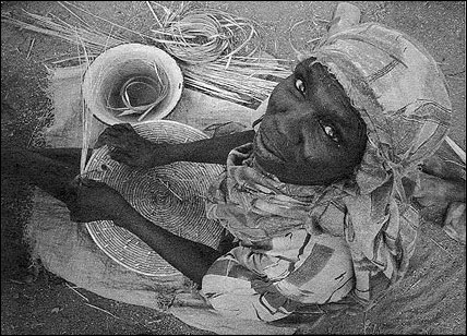
In a refugee camp in Southern Darfur, a woman weaves straw mat covers. Photo by John Donnelly/The Boston Globe.
Finding and Using Numbers
There are several ways for journalists to proceed with numbers in Africa, and this advice applies to such work in other developing countries. First, maintain some skepticism about any figure. This means doing a close examination of the source of the number, looking for evidence of potential biases from the NGO or government providing the statistical analysis.
An important question to ask is who benefits from what the figure tells us. And by asking this question, important contextual information can emerge. For instance, Chin told me that Vietnam, like many African countries, resisted a downward revision of its HIV prevalence numbers—based on the lower rural figures—because it wanted more money from donors and believed a higher rate would attract more funds. On the other hand, Myanmar, which is more concerned with its international reputation than receiving outside funds, has resisted all attempts to raise its HIV prevalence estimates.
Another consideration is not to extrapolate figures, but to use original data on small groups to follow trends. The figures from the antenatal clinics in Africa, for instance, are a good way to follow the infection rates among the pregnant women. In contrast, the HIV national infection rates for countries are almost useless as a barometer since they can be highly inaccurate. And the national averages do not say much about high-risk populations or regions, nor do they tell us much about areas with low rates of infection.
With population estimates, the best information in many countries might be available through door-to-door polio immunization campaigns that aim to inoculate every child under the age of five. After one of these intensive efforts, demographers possess the treasure of a real number—those children under five who have been vaccinated—and from this number they are able to extrapolate the figure for an estimate of the overall population. Often they discover that 150 percent of the population has been vaccinated. In other words, their original estimate was off by at least 50 percent. Alas, Nigeria can’t benefit yet from the polio sweeps because the governor in the northern state of Kano has refused to allow mass polio vaccinations during the past year in his domain, citing distrust of the safety of the vaccine.
There is one final suggestion on how to bring readers closer to the reality that is Africa. It arises out of a project The Boston Globe initiated two years ago to report on people in developing countries who were dying from diseases that the use of known health practices and medical care could have prevented or cured. For more than two weeks, the newspaper sent reporters to four countries—Malawi, Cambodia, Russia and Guatemala. As we spent time side-by-side with people close to death, reporters and photographers from these four teams stayed in close contact by e-mail so we could share our experiences in reporting these stories.
In Cambodia, Russia and Guatemala, journalists had difficulty either in getting access to people who were dying of a preventable disease or had difficulty in finding people. At Lilongwe’s central hospital in Malawi, Globe photographer Dominic Chavez and I were surrounded by needless death. Dozens of people died during the week we were at this urban hospital. In fact, we witnessed so much death that we decided not to profile one person’s death but to profile death as we found it in this hospital ward.
It was a telling moment of the difference and opened my eyes to what makes reporting on Africa such a remarkable assignment. From this story, valuable lessons emerged. Numbers no longer mattered. Africa’s preventable deaths dwarfed what we were finding in the other regions of the world. In this case, comparative journalism revealed far more than any estimate ever could.
Still, reporters want to use numbers in their stories. Just use caution when the numbers come out of Africa. Remain skeptical. Ask tough questions, and find ways to let readers understand the dilemma the numbers pose in their telling. Journalists should find ways to stop this charade of using ever-escalating estimates of disease and disaster that seem to be little more than desperate attempts for attention. In writing about the human suffering that exists on the continent of Africa, whether it is 13 million or 26.3 million Africans who are infected with HIV or 100,000 or two million people in Darfur who have run from their homes, the toll these disasters exact is dreadful. And in Africa, these troubles can be found on a so much greater scale than anywhere else.
What journalists can do is let Africans speak for themselves about the difficulties they confront and the lives they want to lead without depending on numbers that we know are false to “sell” a story that simply deserves to be told.
John Donnelly is the Africa correspondent for The Boston Globe. He has been based in Pretoria, South Africa since September 2003.


