The Search for True North: New Directions in a New Territory
In this time of accelerating change, how journalists do their work and what elements of journalism will survive this digital transformation loom as questions and concerns. By heading in new directions and exploring the potential to be found in this new territory of interactivity and social media, journalists – and others contributing to the flood of information – will be resetting the compass bearing of what constitutes “true north” for journalism in our time.
RELATED ARTICLE
"Mapping the Blogosphere: Offering a Guide to Journalism’s Future"
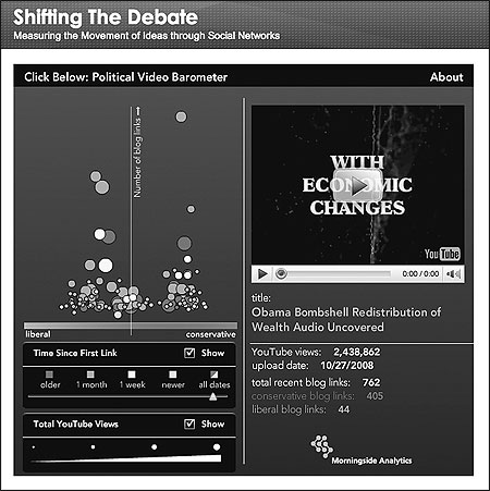
- John KellyAs a visual demonstration of how ideas move through social networks, Morningside Analytics created a user-friendly online tool called the “Political Video Barometer.” The barometer features an interactive graph showing recent YouTube videos popular with liberal and conservative bloggers. The horizontal axis shows the proportion of liberal vs. conservative bloggers linking to a video, and the vertical axis shows how many bloggers overall have linked to it. Click on a dot and the video plays—instantaneously. This map is available at www.shiftingthedebate.com.


